
Why 2026 Is a Turning Point for Wedding Stationery
The wedding invitation trends 2026 couples are gravitating toward share one thing in common: they want the invitation to feel like something before a guest even reads a word. White will always be timeless, but this year, timeless isn't enough. The biggest shift happening in luxury wedding stationery right now isn't just about color trends or typeface choices in isolation. It's about how every element works together as a complete, intentional system that sets the tone for an entire celebration.
Wedding stationery has quietly crossed a threshold. Couples who once focused primarily on wording and paper weight are now thinking like designers. They're choosing palettes that evoke specific moods, commissioning typography that feels custom rather than templated, and treating the invitation suite as the first chapter of a story rather than a logistical necessity.
The Heritage Collection was built with exactly that shift in mind. Here's how it maps to every major trend defining refined wedding invitations this year.
Trend 1: Color Is Introducing the Wedding, Not Just Matching It
For years, the rule was simple: match your invitation to your wedding colors. Blush wedding? Blush invitation. Navy and white? Navy and white. The stationery was a preview of the tablecloths.
In 2026, that approach feels limiting. Color in luxury stationery has taken on a far more active role. It isn't a backdrop anymore. It's the first emotional impression a guest receives, before they register the wording, before they notice the paper weight, before they read a single name.
The couples who understand this are choosing palettes that feel grounded, layered, and intentional. They're selecting colors that say something about who they are and what kind of celebration this will be. And the stationery studios leading the space are responding with suites that feel composed rather than decorated.
This is the shift the Heritage Collection was designed around. Every colorway was chosen because it supports and elevates the design rather than competes with it. These are palettes with weight, texture, and meaning.
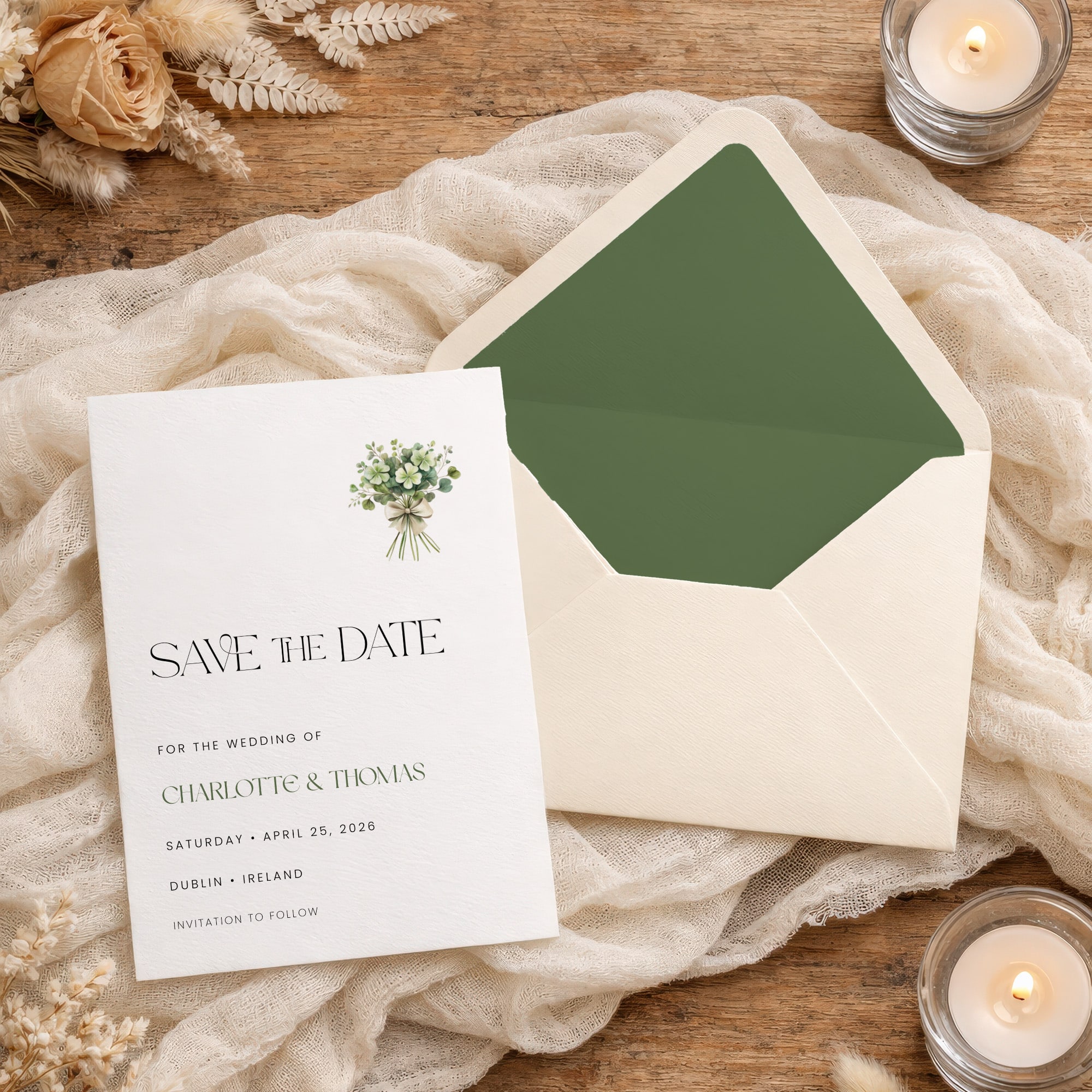
Trend 2: Grounded Greens and the Rise of Quiet Luxury
Sage, olive, and eucalyptus are leading the move toward what the design world has started calling quiet luxury in stationery. These aren't the bright, saturated greens of a few years ago. They're soft, grounded, and effortlessly elegant.
What makes them work is exactly what makes them understated. These tones don't fight for attention. They settle into a suite and create a sense of calm confidence. Paired with warm neutrals, refined typography, and the right paper texture, they produce an invitation that feels composed rather than decorated.
The Heritage Collection embraces this palette because it photographs beautifully, translates across seasons, and never feels like it's chasing a moment. Sage and olive feel just as relevant for a spring garden ceremony as they do for an autumn estate wedding.
Trend 3: Warm Earth Tones Bring Depth and Presence
Terracotta, burnt orange, warm sand, and sunset peach bring something that white and blush never quite could: weight and presence.
These tones feel textural even before you touch them. They're editorial, slightly unexpected, and full of character. They evoke warmth, sunlight, and materiality in a way that creates invitations that feel tangible rather than flat.
What's notable about this trend is how well these palettes interact with finishing techniques. Copper foil on terracotta. Gold letterpress on warm sand. A linen-textured cardstock in burnt sienna with a cream wax seal. The richness of the base color makes every finishing detail feel more intentional.
The Heritage Collection uses warm earth tones in exactly this way, as a foundation that makes the craft visible without the design ever feeling overdone.
Trend 4: Cool Neutrals and Dusty Blues Hold the Room
There's a quiet confidence to dusty blue, soft grey, and silver-mist tones that makes them some of the most versatile palettes in 2026 stationery.
They don't demand attention. They hold it. There's a restraint in these colors that creates space for typography to lead and allows the overall composition to breathe. For couples who want their suite to feel considered rather than loud, cool neutrals deliver exactly that.
Dusty blue in particular has moved well beyond its association with coastal or nautical themes. In a matte cardstock with silver foil lettering and a clean editorial layout, it reads as refined and contemporary. In a velvet-texture finish with white typography, it becomes something closer to architectural.
The Heritage Collection treats cool neutrals as one of its strongest signature moves, pairing them with the kind of typographic hierarchy that makes the palette feel like a deliberate design choice rather than a safe default.
Trend 5: Deep Moody Tones for Drama Done Right
Burgundy, plum, deep mauve, and smoky jewel tones are making a significant comeback in 2026, and it's not hard to understand why.
These colors create depth, contrast, and intimacy in a way that lighter palettes simply can't. A deep plum invitation card with rose-gold foil lettering and a velvet-finish box doesn't just look luxurious. It feels like an event.
The key with moody tones is restraint in composition. The color itself is doing significant work, which means the typography needs to be cleaner and the layout more structured. When the balance is right, these suites create the kind of first impression that guests remember and talk about.
The Heritage Collection approaches deep palettes with exactly this discipline, letting the color carry the drama while the design remains deliberate and controlled.
Trend 6: Warm Neutrals as the New Minimalism
Minimalism hasn't gone anywhere. It's just gotten warmer.
The stark white and cool grey minimalism of a few years ago is giving way to something with more texture and personality. Almond, oat, sand, and chocolate brown are becoming the preferred neutral foundations for couples who want their invitation to feel elevated but not maximalist.
These palettes work because they allow the structure of the design to be the hero. When the color itself is quiet and warm, every typographic choice, every finishing detail, every element of spacing and proportion becomes visible. There's nowhere to hide, which means everything has to be considered.
This is actually one of the hardest palettes to execute well, which is why it's become such a clear differentiator between studios that design and studios that assemble. The Heritage Collection's warm neutral suites are some of its most deceptively simple and most technically demanding work.
Trend 7: Typography Is What Makes It Feel Expensive
Color sets the mood. Typography defines the quality.
In 2026, the invitations that stop people in their tracks aren't the most elaborate ones. They're the most considered. Strong visual hierarchy. Custom lettering. Editorial composition. Typography that guides the eye and signals, immediately, that this is the real thing.
There's a reason couples can feel the difference between something designed and something assembled, even when they can't articulate exactly what it is. It's in the spacing between lines. It's in the proportion of the decorative title to the body copy. It's in whether the layout has a clear flow or simply fills the space. Typography is the infrastructure that makes everything else work, and when it's right, it's invisible in the best possible way.
Every decorative title in the Heritage Collection is hand-crafted and designed to work as part of a complete visual system. Nothing is dropped in from a template. Every element is placed with intention. The result is stationery that looks effortless precisely because so much thought went into every decision.
Trend 8: The Full Suite as a System
The most important shift in 2026 isn't a single color or a single typeface. It's a philosophy.
Couples are learning to recognize refinement. They notice when something flows, when it feels balanced, when it feels complete. An invitation suite isn't a collection of separate pieces that happen to coordinate. It's one cohesive story told across every card, envelope, insert, and detail.
A strong color without structure feels overwhelming. Beautiful typography without the right palette falls flat. A well-designed card inside a mismatched envelope breaks the spell. When every element is designed as part of a system, the result is something that feels effortless to receive, even though it was anything but effortless to create.
This is the standard the Heritage Collection was built to meet. Every suite is a designed system, not an assembled package. The color, the typography, the paper, the finishing technique, and the envelope all come from the same design conversation. That's what makes it feel complete.
How to Know When an Invitation Is Truly Refined
It can be surprisingly difficult to articulate what makes one invitation feel luxurious and another feel expensive without feeling refined. But once you know what to look for, it becomes easy to spot.
Refined stationery has a clear visual hierarchy. Your eye knows exactly where to start and where to go next. The most important information carries the most visual weight, and the layout creates a natural reading flow.
Refined stationery has intentional negative space. The design isn't trying to fill every inch of the card. There's breathing room, and that restraint communicates confidence.
Refined stationery uses color consistently and purposefully. Every shade in the suite connects to the others. Nothing feels accidental.
Refined stationery holds up under close examination. The more time you spend with it, the more considered it reveals itself to be.
The Heritage Collection is designed to meet every one of these standards, because the couples who choose it are exactly the kind of people who will notice.
The Heritage Collection: Already There
The trends defining luxury wedding stationery in 2026 aren't new directions. They're the culmination of a longer shift toward intentionality, craftsmanship, and design that functions as a complete system rather than a coordinated collection of parts.
The Heritage Collection has been building toward this moment. The palettes, the hand-crafted typography, the suite-as-system philosophy: all of it reflects exactly where the most discerning couples and the most respected stationery designers are landing right now.
Your invitation is the first impression of everything that follows. It should feel like it knows exactly what it is.
The Heritage Collection does.
Frequently Asked Questions
Ready to see how the Heritage Collection can set the tone for your wedding day?
0 Comments