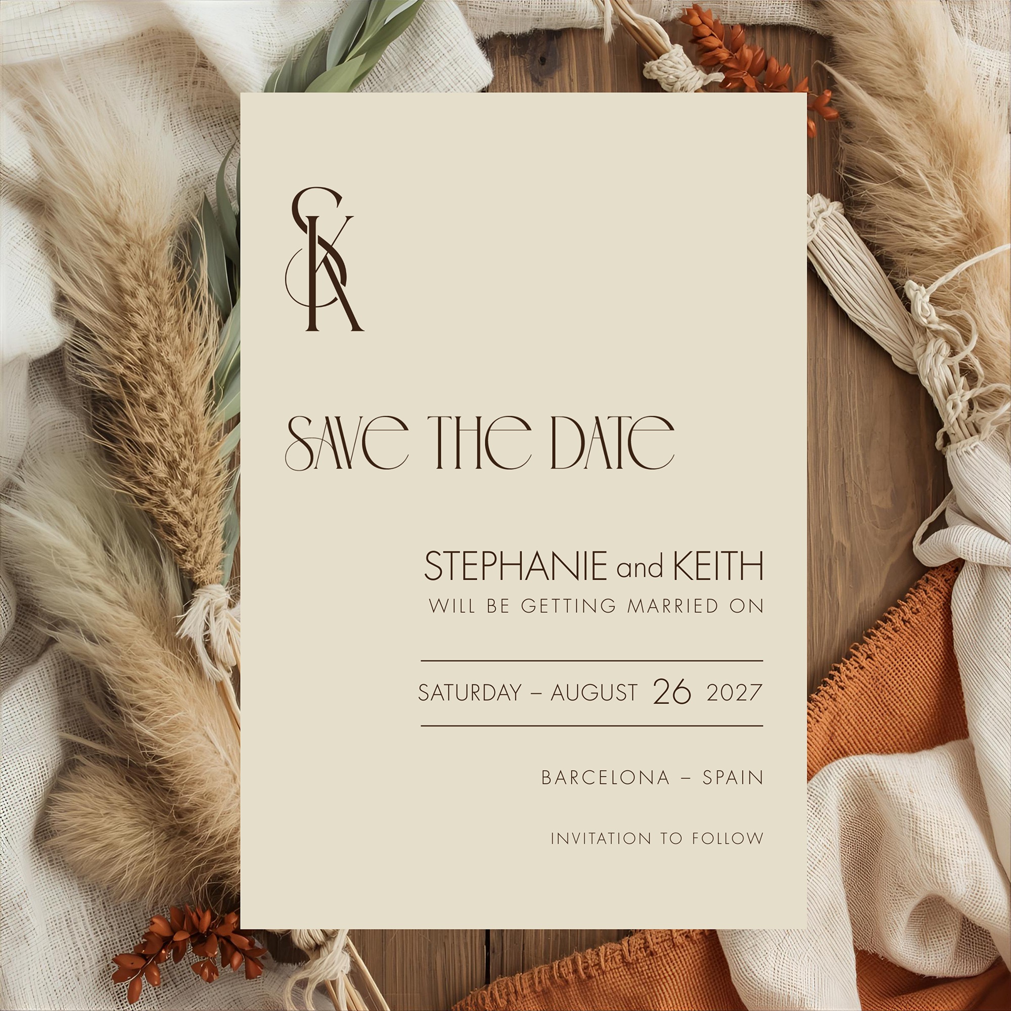
Long before monograms became a stationery trend, they were something closer to a signature. A way of marking correspondence, linens, and eventually a wedding day, in the visual language of the people involved.
A beautifully designed monogram can become one of the most distinctive details of a wedding stationery suite. More than a decorative flourish, it creates a visual thread that connects everything from the first Save the Date to the final thank you note. And while monograms have a long history, they don't have to feel formal or old-fashioned. The key is in how the monogram is designed, and just as importantly, how it is used.
What Is a Wedding Monogram?
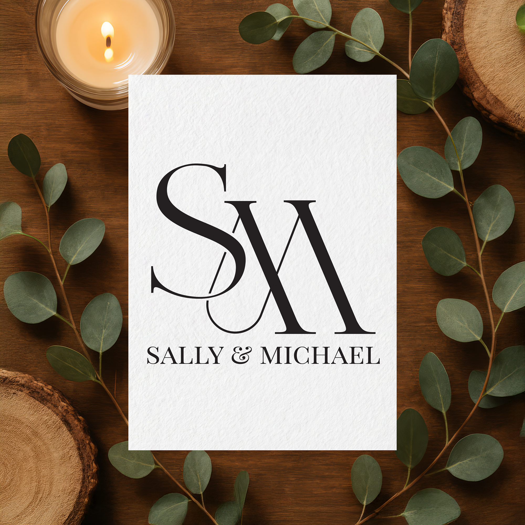
At its simplest, a wedding monogram combines the initials of a couple into a single design. The letters may overlap, intertwine, sit side by side, or arrange themselves around a connecting ampersand.
But a good monogram is more than two letters placed together. Typography, spacing, scale, and proportion all matter. A delicate script monogram creates a completely different impression than one built from strong serif letterforms, and the same two initials can produce dramatically different designs depending on the typeface and arrangement chosen.
That is what makes a monogram interesting. It can be traditional, modern, romantic, minimal, or something in between, and once it feels right, it can become a signature for the entire wedding.
Start with the Save the Date
The Save the Date is often the first piece of stationery a guest sees, which makes it a natural place to introduce a monogram.
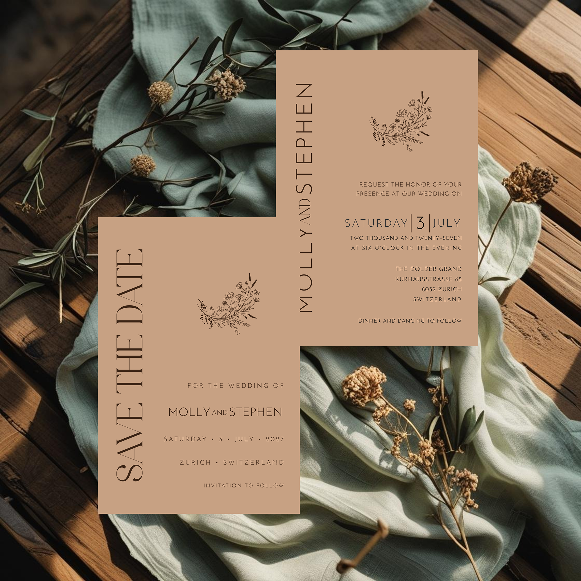
It doesn't need to dominate the design. The Parchment Save the Date above uses a small ampersand monogram set above the couple's names, an interlocking initial pairing rendered in Bemine, the same typeface used throughout the suite. It sits quietly at the top of the page rather than competing with the Save the Date headline beneath it.
Think of it as the first chapter, not the entire story. Guests will see this monogram again on the invitation, so this is where the visual language for everything that follows gets set.
Let the Invitation Take Center Stage
When the formal invitation arrives, guests may already recognize the monogram from the Save the Date.
Here, there are more choices. The monogram can sit at the top of the invitation as a focal point, appear modestly at the bottom, or move to an accompanying card instead of the invitation itself.
Sometimes the most elegant choice is to leave it off the invitation entirely. If the typography on the invitation is already making a strong statement, as it is in a suite like Parchment, adding another decorative element can crowd the design. In that case, the monogram often works better on the Details Card, the RSVP, or the envelope.
Good stationery doesn't require every element to appear everywhere.
Carry It Into the Wedding Day
This is where a monogram earns its keep. Once it's established in the invitation suite, it can repeat throughout the wedding day pieces:
- Ceremony programs
- Menus
- Place cards
- Table numbers
- Seating charts
- Welcome signs
- Favor tags
- Cocktail napkins
- Thank you notes
It doesn't need to appear on all of them. In fact, it shouldn't. Repeating a monogram thoughtfully, on a menu and a thank-you note, for example, creates continuity. Repeating it on every surface turns a design detail into a logo campaign.
Change the Scale
One of the easiest ways to keep a monogram feeling fresh rather than repetitive is to change its scale from piece to piece.
On the Parchment Save the Date, the monogram is small and understated. On a menu, that same mark could become larger, almost architectural. On a place card, it might shrink again to the smallest detail on the page.
The monogram itself doesn't change. The way it interacts with each piece does, and that variation is part of what makes a coordinated suite feel deliberate rather than simply matched.
Give It Some Breathing Room
Monograms tend to work best with a little space around them. If a monogram includes interlocking letters or a connecting ampersand, like the one on Parchment, surrounding it with too many other elements makes it harder to read.
White space gives the eye somewhere to rest and lets the letterforms do the work. This matters even more with a suite like Parchment, where the palette is already restrained and neutral. The monogram is one of the few elements doing anything decorative, so it doesn't need competition.
Your Monogram Doesn't Have to Match Everything
Here is where it gets interesting. A monogram should belong to the same visual family as the rest of the suite, but it doesn't need to use every typeface found in the invitation.
Sometimes a monogram works because it introduces a bit of contrast. A clean, editorial invitation might be paired with a more expressive monogram. A romantic suite might use a surprisingly simple, restrained one.
The goal isn't to make everything identical. It's to make everything feel like it belongs together, the way the Parchment monogram and the suite's typography share a family resemblance without being interchangeable.
Don't Forget the Thank You Note
After the wedding, the monogram can make one final appearance on the thank you stationery. There's something nice about that. The same small mark a guest first saw on the Save the Date returns at the end of the celebration, creating a satisfying sense of completion.
Unlike a wedding date or a venue illustration, a well-designed monogram can have a life beyond the wedding itself. It can move onto personal stationery or correspondence long after the thank-you notes are mailed.
A Small Detail That Can Define the Whole Suite
Wedding stationery is often remembered for its details: the weight of the paper, the typography, the spacing, the way the pieces feel together in hand. A monogram is one more of those details.
It doesn't need to be large. It doesn't need to appear everywhere. It just needs to feel intentional, the way the small monogram above the Parchment Save the Date does: understated, deliberate, and consistent with everything that follows it.
Frequently Asked Questions
Rooted in tradition. Designed with intention.