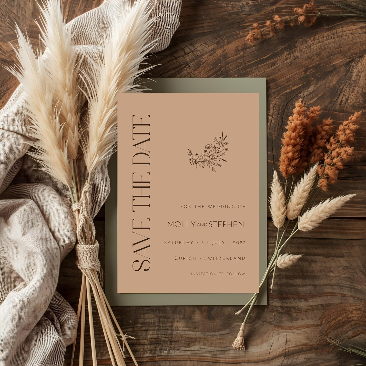
There are colors that simply decorate a wedding, and then there are colors that establish its entire mood. Terracotta belongs firmly in the second category.
Warm, earthy and unmistakably inviting, terracotta has become a favorite in wedding design. But its appeal reaches far beyond the current fascination with earthy palettes. Terracotta is a color rooted in history, architecture, art and the natural world. Used thoughtfully, it can feel remarkably sophisticated.
That was the idea behind the Terracotta Collection in the Patti & Hank Heritage Collection.
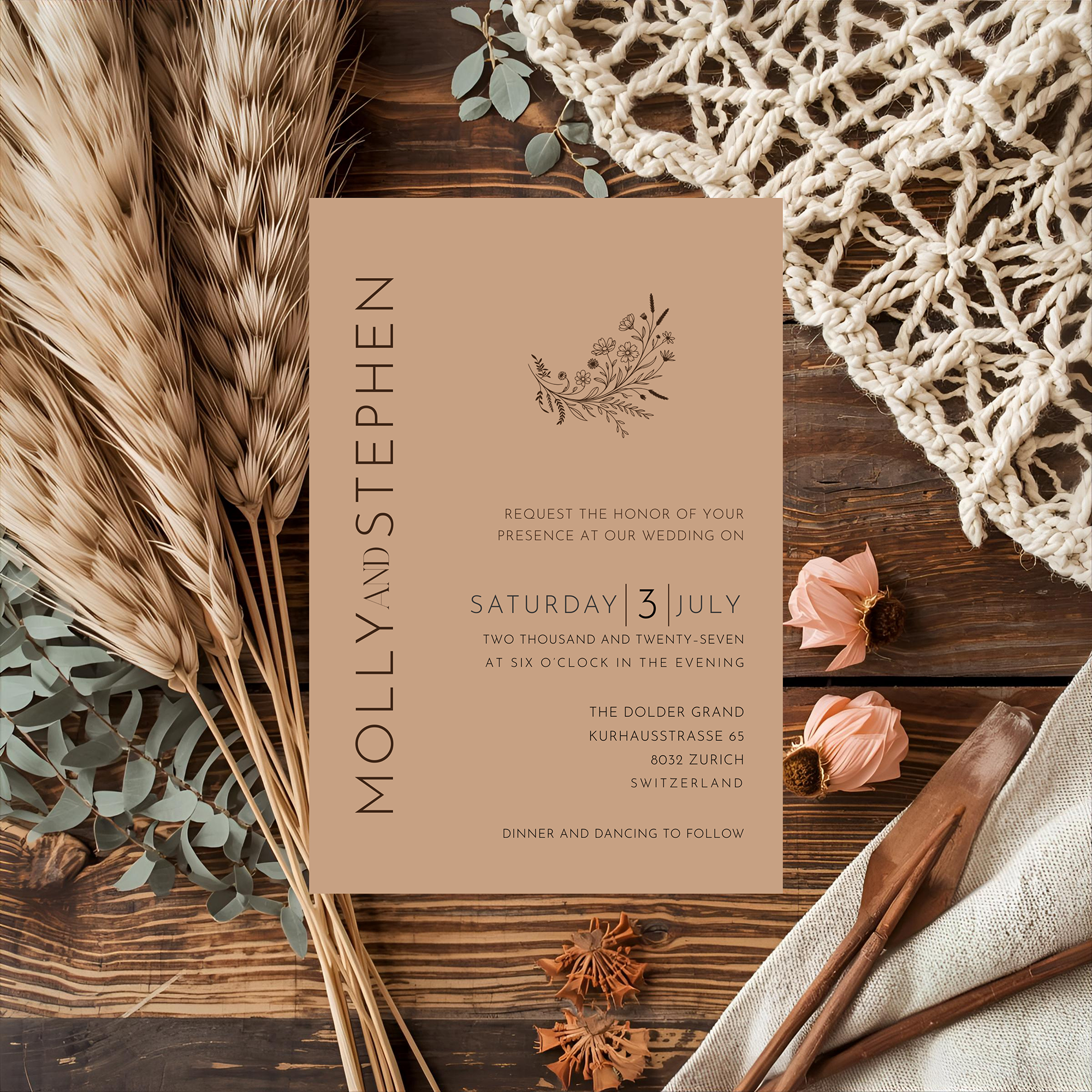
Rather than treating terracotta as a theme, I wanted to treat it as a color with presence. The result is wedding stationery that feels warm and romantic while remaining clean, polished and timeless.
Is Terracotta Just a Wedding Trend?
The word terracotta comes from the Italian terra cotta, meaning "baked earth." For thousands of years, clay in shades of rust, ochre, burnt orange and warm brown has appeared in pottery, sculpture, tile and architecture.
Perhaps that history is part of what makes the color feel so comfortable to us. It comes directly from the earth.
Patti's Design Note: I think of Tuscany often when I think about terracotta — the warmth of standing among buildings in those sun-washed shades of clay, ochre and burnt orange, softened by age and the Tuscan light. Nothing felt overly designed or perfectly matched. It simply felt warm, timeless and welcoming. That memory stayed with me, and I returned to it while developing the Terracotta Collection. I wanted to capture that same feeling: warmth without heaviness, richness without formality, a color that feels as though it has always been there.
In wedding design, terracotta is sometimes immediately associated with a particular aesthetic — rustic tables, dried grasses, desert landscapes, bohemian décor. It certainly works beautifully in those settings, but limiting terracotta to rustic weddings misses much of what makes the color interesting. Pair it with beautiful typography, restrained ornamentation and plenty of breathing room, and terracotta takes on an entirely different personality.
It becomes elegant.
Designing the Terracotta Collection
When I design a wedding stationery collection, I don't begin by asking what's trending. I think about how the design will feel when someone receives it.
An invitation is an introduction. Before guests see the venue, the flowers, the tables or the wedding dress, they may see the invitation first. Its color, typography and composition begin telling the story of the celebration long before the wedding day arrives.
For the Terracotta Collection, I wanted that first impression to feel warm and confident without becoming overly decorative. The terracotta background creates richness immediately, and from there, the typography is allowed to do much of the work.
That balance matters. When a color has this much personality, the design doesn't need to compete with it.
Does Terracotta Work with Bold Typography?
As a graphic designer, I'm always interested in what happens when typography and color meet. Terracotta provides an especially beautiful backdrop for type because it has depth without the severity of a very dark color — it can support strong typography while retaining softness.
That makes hierarchy particularly important. Names should feel significant. Supporting information should be easy to read. White space should be intentional. Decorative elements should enhance the composition rather than fill every available corner.
Behind the Design: This is one of the principles behind the Heritage Collection as a whole. The stationery should feel designed, not decorated. There is a difference — good design knows when to add something, but it also knows when to stop.
What Colors Pair Well with Terracotta?
One of terracotta's greatest strengths is its versatility. It shifts personality entirely depending on what you pair it with:
- Ivory, cream or parchment — soft and romantic
- Olive or sage green — Mediterranean and relaxed
- Black or deep espresso — dramatic and contemporary
- Soft blush — brings out its romantic side
- Muted gold — adds a subtle sense of formality
- Blue — a cooler contrast that feels collected rather than perfectly matched
That flexibility lets couples take the stationery in very different directions. A Tuscan-inspired wedding, an autumn celebration, a modern city wedding and an intimate garden dinner could all begin with terracotta stationery and end up looking completely different.
The color provides the foundation. It doesn't dictate the wedding.
Printed Terracotta or Colored Stock: Which Is Better?
A digital design can represent a terracotta background beautifully, but couples have choices when translating that color to paper:
- Printing the color onto white stock — gives greater control over the exact shade
- Choosing paper already manufactured in a warm, earthy tone — lets the natural character of the stock become part of the finished piece
Neither approach is inherently better — it depends on the printer, the paper, the printing method and the look you want to achieve.
Patti's Design Note: I encourage couples using editable templates to think beyond what they see on a screen. Wedding stationery ultimately becomes a physical object. Paper weight, texture, color and printing all contribute to the final impression.
From Invitation to Wedding Day
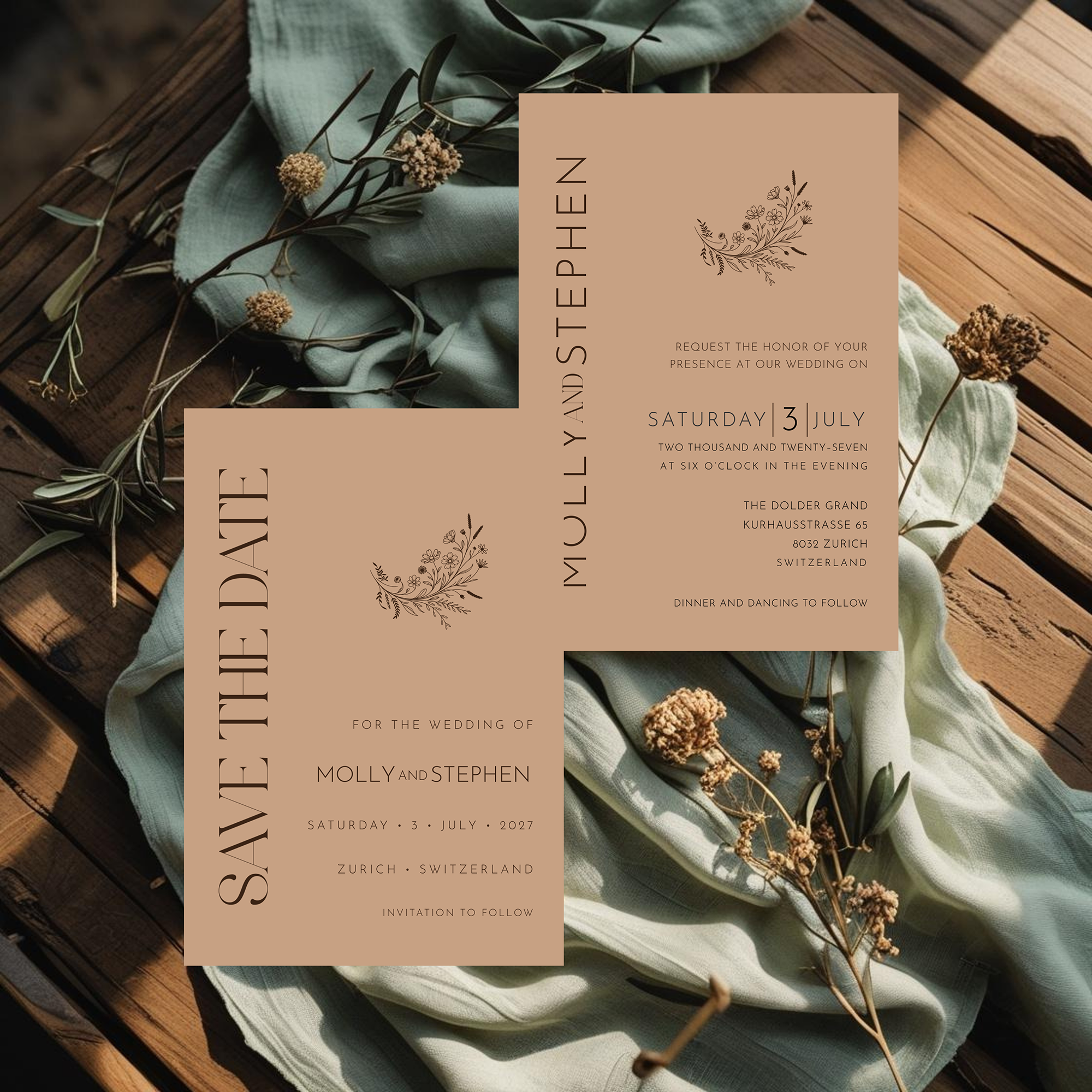
A wedding collection becomes especially effective when its visual language continues beyond the invitation. The Terracotta Collection was designed to carry that look throughout the celebration, from the Save the Date and invitation suite to menus, place cards, table stationery and thank-you notes.
That doesn't mean every piece needs to be identical. In fact, I prefer when they're not.
A strong stationery suite feels related rather than repeated. Typography, color and design details create continuity while individual pieces are allowed to serve their own purpose. When those elements appear throughout the wedding, they quietly tie everything together.
A Modern Color with a Very Long History
Wedding trends will always come and go. Certain colors become enormously popular, disappear for a while, and eventually return.
Terracotta may be having a wedding moment, but terracotta itself isn't a trend. It has existed in our homes, gardens, buildings and art for centuries — a permanence that many fashionable palettes simply don't have.
Perhaps that's why it works so well for wedding stationery. It feels warm without being sweet. Romantic without being delicate. Earthy without having to be rustic.
Most importantly, it gives typography and thoughtful design room to shine.
For couples who want wedding stationery with warmth, character and a little unexpected sophistication, terracotta might just be the perfect place to begin.
Frequently Asked Questions
Terracotta might just be the perfect place to begin.