There comes a point in almost every design project when you have to ask yourself a hard question: is the design wrong, or am I just not showing it the right way?
Recently, I found myself asking exactly that about the Heritage Collection.
I knew I loved the stationery. The typography, the colors, the botanical artwork, the individual personality of each of the twelve suites — none of that was in question. I wasn't second-guessing French Blue or English Garden. I wasn't rethinking Tuscan, Irish Inspired, Southern, or Coastal.
The designs weren't the problem. The presentation was. And once I saw that, I couldn't unsee it.
A Beautiful Design Still Has to Be Seen
Designers spend an extraordinary amount of time on details most people will never consciously notice: the weight of a typeface, the space between two lines, the scale of a flower, the exact shade of blue, whether something should move three pixels to the left.
Those small decisions add up to the finished piece. But once that piece has to live online, there's a whole second layer of design at work. How is it photographed? How close is the camera? What surrounds it? Does the background support the stationery, or compete with it? Can you actually read the typography? And most importantly: does the image communicate what the stationery feels like?
That last question was the one I couldn't shake. The Heritage Collection is meant to feel considered, romantic, and traditional without being stuffy, distinctive enough that it doesn't read as one more template pulled from a sea of nearly identical options. My images weren't quite getting that across.
So I Started Over
This wasn't a redesign of the Heritage Collection. It was a redesign of how you experience it.
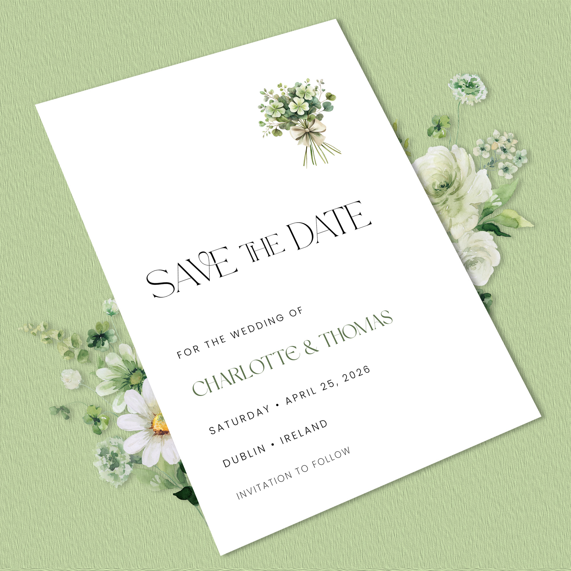
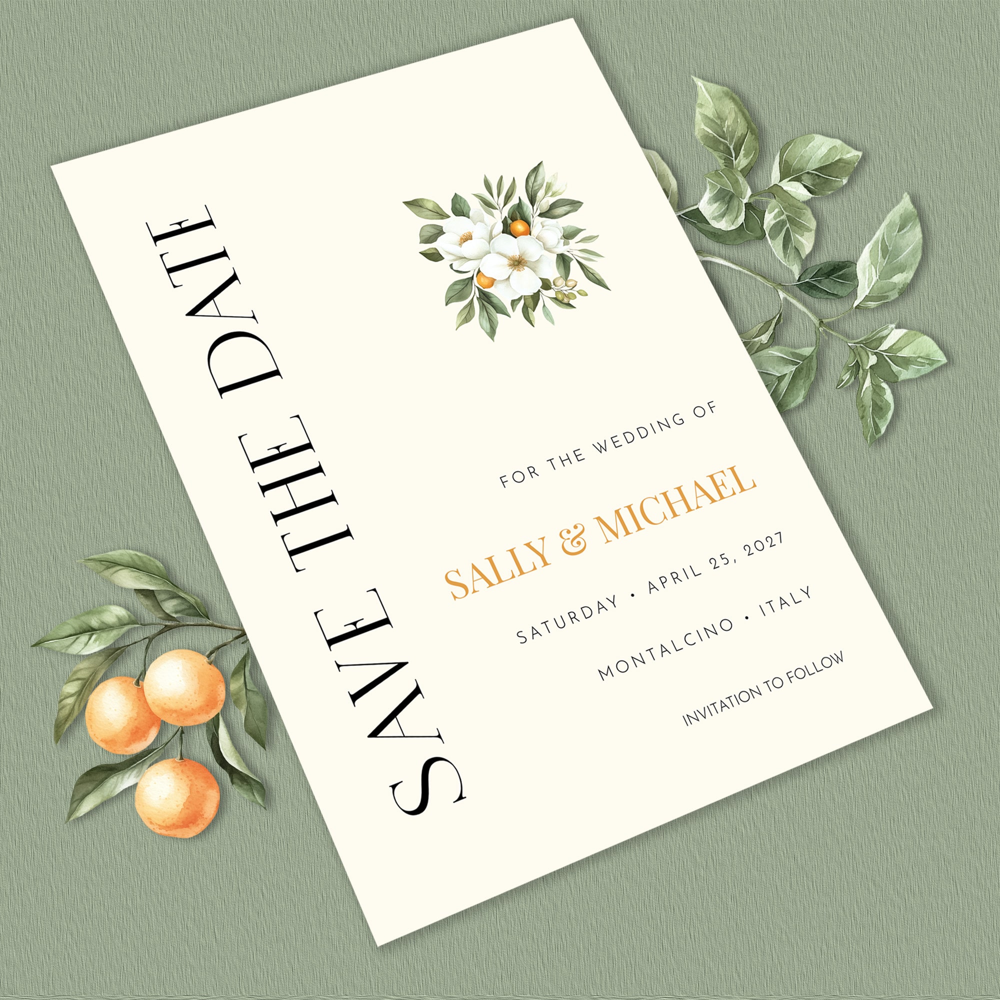
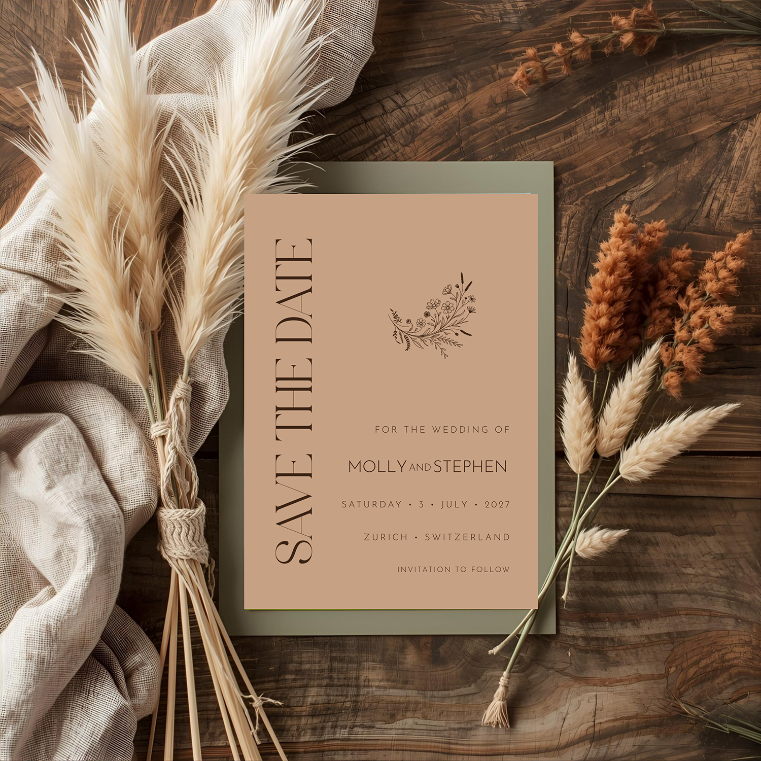
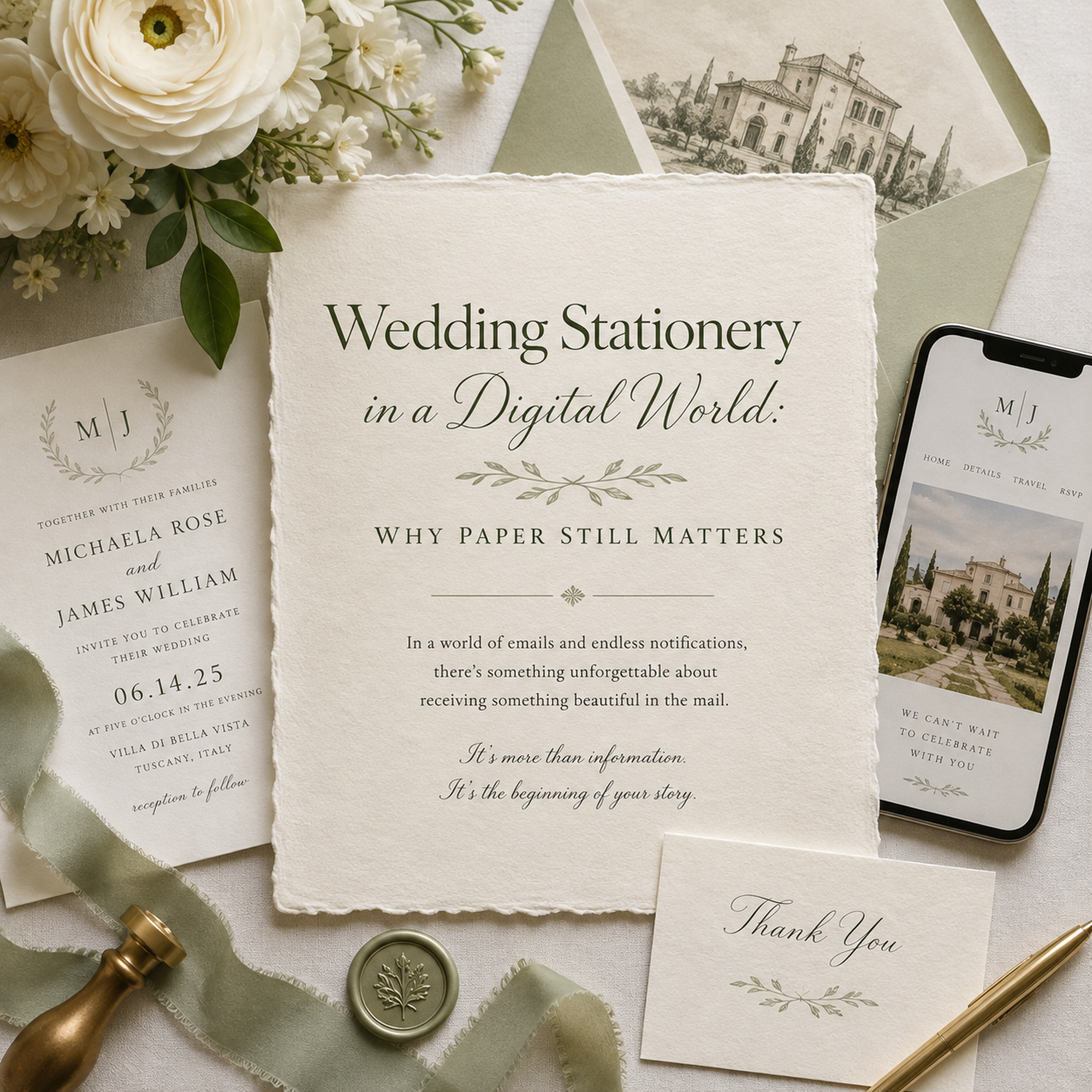
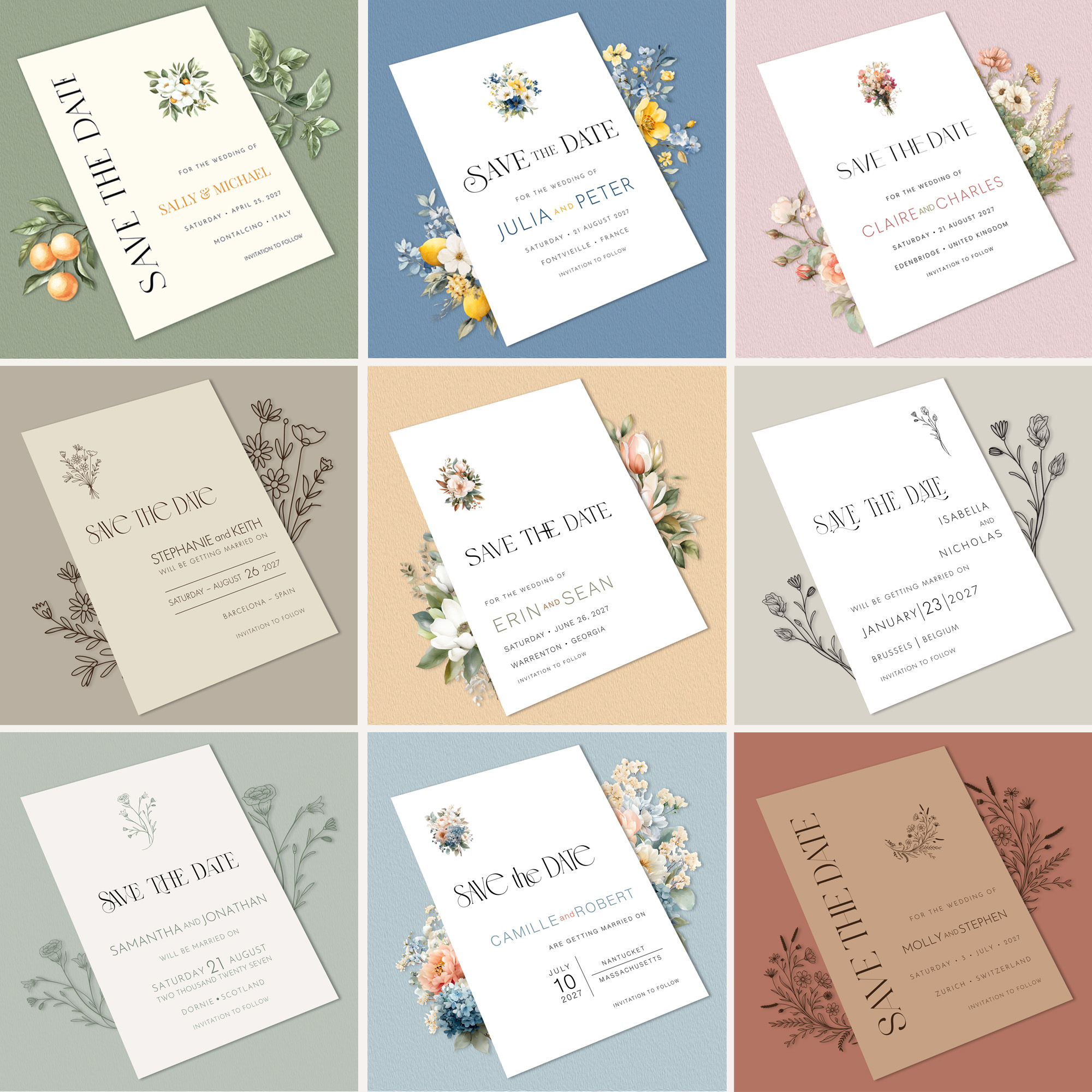
I photographed the stationery, brought the images into Photoshop, and rebuilt the presentation around the designs themselves. Some pieces needed to be larger. Some needed repositioning. Some of the surrounding elements needed to go entirely.
Then I started pulling artwork from the collections themselves into the images, and that changed everything. The snapdragons from English Garden could become part of the scene instead of staying confined to the card. Botanical elements could extend past the edge of the stationery. The colors around each design could come straight from that collection's own visual world.
I wasn't just photographing stationery on a background anymore. I was building an image that actually belonged to the collection.
The Background Matters More Than You Think
One of the more interesting parts of this process was choosing backgrounds. It would have been easy to build one flat lay, swap the stationery twelve times, and call it done. It also would have been boring.
French Blue shouldn't feel like Terracotta. Irish Inspired shouldn't live in the same visual world as Black & White. English Garden shouldn't look like Coastal. Each suite has its own personality, and I wanted the imagery to reflect that.
At the same time, I didn't want the Heritage page to turn into a patchwork of twelve unrelated photographs; they still needed to work together as a collection. That meant finding the line between individuality and consistency: too much sameness and the suites blur together; too much variation and the page loses its cohesion. It's the kind of balance that sounds simple until you're staring at twelve images on a screen, moving them around for the tenth time.
Sometimes the Answer Isn't Another Redesign
Designers are notorious for wanting to fix things. Something feels off, so we change the font. Then the color. Then the layout. Then, eventually, the whole concept.
But sometimes the design isn't asking to be fixed; it's asking to be presented better. That distinction matters. I could easily have started tweaking the Heritage designs themselves because something about the website wasn't sitting right. Instead, I traced the problem back to its actual source. The stationery still felt right. The photographs didn't. Once I understood that, the fix became obvious.
Online, the Photograph Becomes Part of the Product
There's a practical reality to selling stationery online: you can't pick it up. You can't run your fingers across the paper. You can't hold a Save the Date next to its envelope and see how the two sit together.
The photograph has to do all of that work. For a few seconds, it has to stand in for the experience of holding a beautiful piece of stationery in your hands. That's a lot to ask of one image, and it's why I've become less and less willing to settle for a photo just because it technically shows the product. Showing it isn't enough. I want you to be able to imagine it.
The Heritage Collection, Seen Differently
The new imagery is now live across the Heritage Collection, Save the Date, and Bridal Shower pages. The stationery hasn't changed. What's changed is the way I'm inviting you to see it.
That might be one of the more useful lessons twenty-five years of design work has taught me: when something isn't working, don't reach for a redesign first. Make sure you've given the design a real chance to be seen at its best.
Sometimes that means changing a typeface. Sometimes it means moving something three pixels. And sometimes it means looking at everything you've already built and realizing:
The design is right. Now let's show it that way.
Designed with intention.
Made to be remembered.