When you think of a wedding in Tuscany, certain images come to mind immediately.
A centuries-old villa. Cypress trees lining a winding drive. Vineyards stretching toward the horizon. Long tables beneath a pergola. Blue and yellow. And, inevitably, lemons.
They're beautiful images. They're also everywhere.
When I began designing the Tuscan collection for Patti & Hank, I knew I wanted it to capture the warmth and romance of Tuscany. I also knew almost immediately what I didn't want.
I didn't want to put a villa on the invitation. And I didn't want to use lemons.
Those weren't accidental omissions. They were deliberate design decisions.
Designing From a Memory, Not a Postcard
I've been fortunate enough to spend time in Tuscany, and what stayed with me wasn't one particular villa, vineyard, or landmark. It was the color.
I remember the warmth of the terracotta buildings and how naturally those colors sat against the landscape, the aged plaster, clay roofs, stone, and greenery all seemed to belong together. And there was that Tuscan light that made everything feel warmer.
That's the Tuscany I remembered. And that memory mattered more to the design than any illustration of a particular place ever could.
I wanted Tuscan to feel like Tuscany without having to announce it. That distinction became the foundation of the collection.
Why Doesn't the Tuscan Collection Feature a Villa?
There's nothing wrong with a beautiful illustration of a Tuscan villa. For a couple marrying at a particular property, a custom illustration of their venue can be incredibly meaningful. But that's a different kind of stationery.
Once a villa appears on an invitation, the villa becomes the story. It sets a specific place and a specific interpretation of what a Tuscan wedding should look like, and I wanted more freedom than that.
Without the villa, the typography, color, floral elements, and composition get to tell the story instead. As a graphic designer, that's far more interesting to me.
Why Does the Collection Use Orange Blossoms Instead of Lemons?
There was another image I deliberately avoided: lemons.
Blue and yellow, often paired with bright yellow lemons, have become almost a visual shorthand for Italian-inspired weddings. It's beautiful, cheerful, and immediately recognizable. It's also been used again and again.
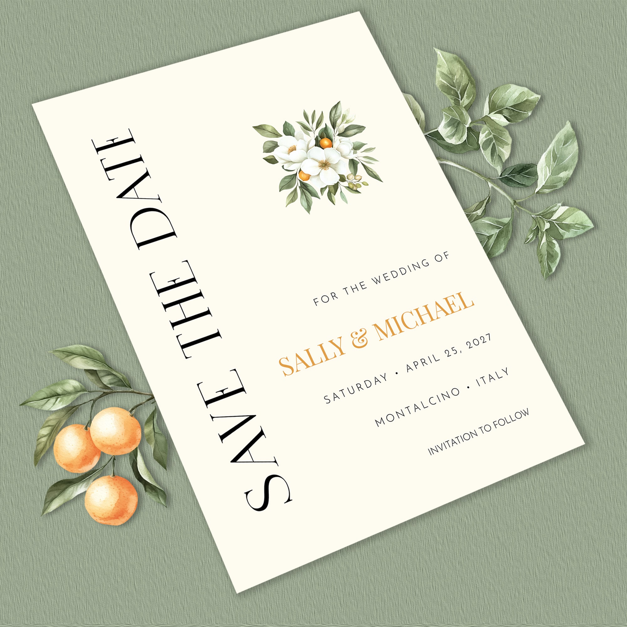
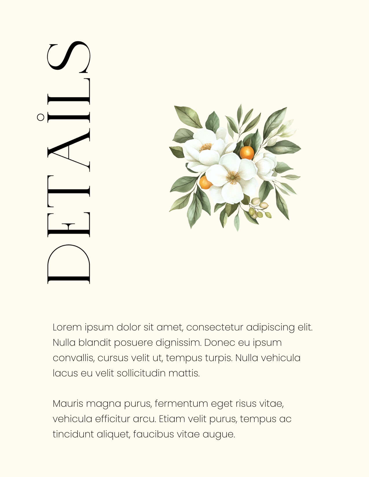
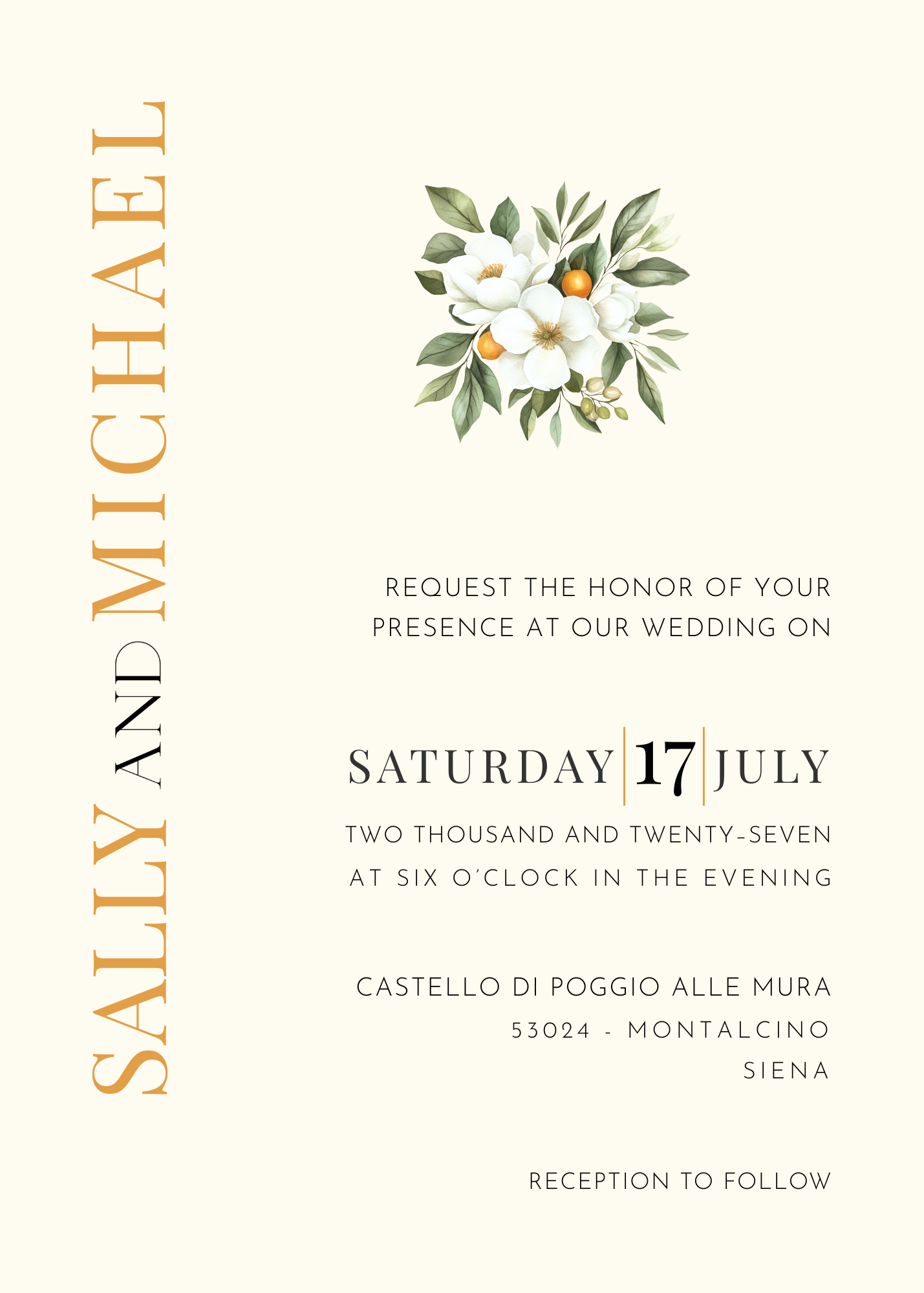
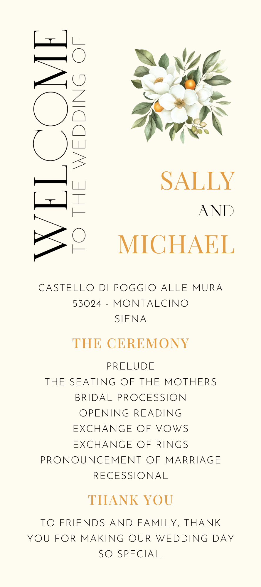
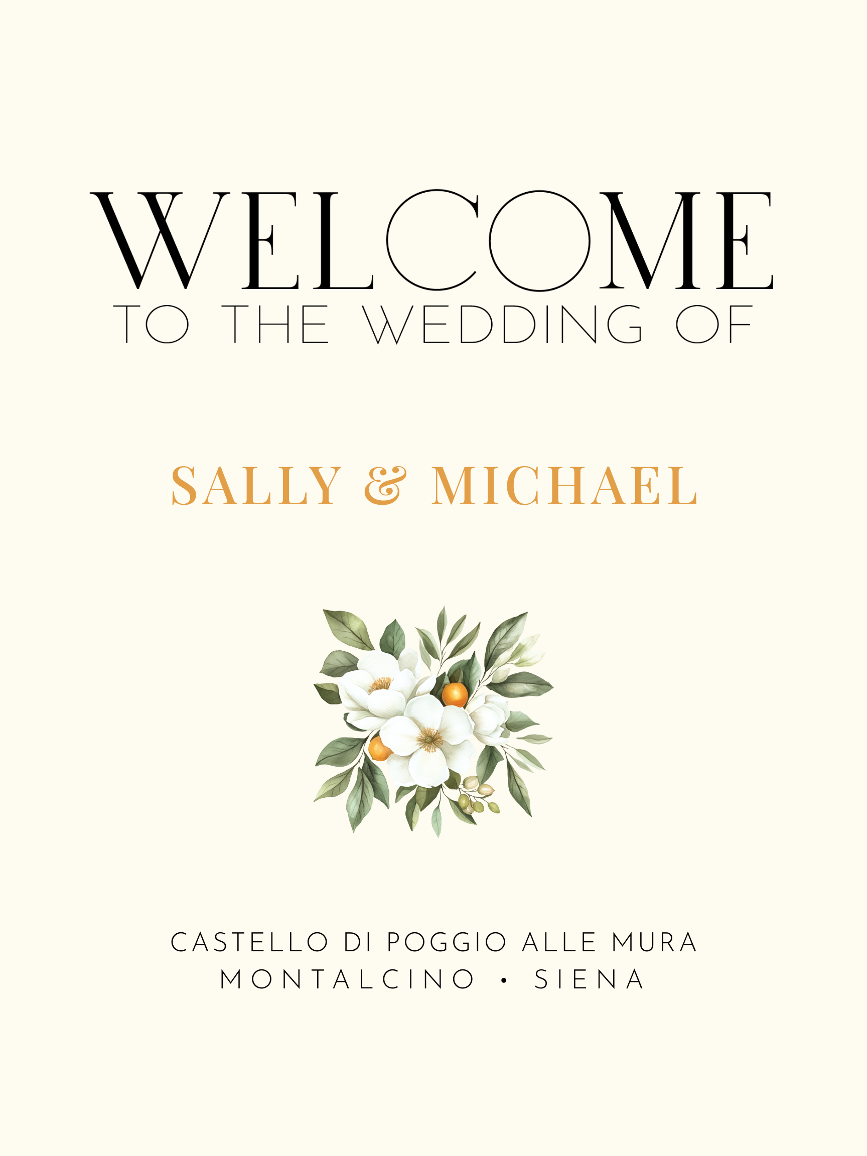
I wanted Tuscan to go somewhere else, so I chose the orange blossom instead.
Orange blossoms have a long connection to weddings. For generations, the delicate white flowers have appeared in bridal bouquets, wreaths, and other wedding adornments, a history that appealed to me, especially for a design that would eventually join the Heritage Collection.
But I also simply loved what the orange blossom brought to the page. It's graceful without being overly romantic. The green foliage ties naturally back to the landscape, while the blossoms soften the composition without competing with the typography.
Most importantly, an orange blossom doesn't shout Italian wedding. It just feels like it belongs there.
Font: Monte Carlo
Tuscan
Letting Typography Do the Work
Typography has always been one of the most important elements of my work, and with Tuscan, I wanted the type itself to carry personality. Its unexpected placement gives the invitation its character and keeps the design from slipping into the visual shorthand we so often associate with destination weddings.
There doesn't need to be a watercolor vineyard in the corner. There doesn't need to be an olive branch surrounding every name. There doesn't need to be a sketch of a villa, or a bowl of lemons.
The typography is allowed to carry the design. That restraint is intentional.
Does Tuscan Wedding Stationery Only Work for Weddings in Italy?
There's an important difference between being inspired by a place and building a theme around it. I wanted Tuscan to be inspired by Tuscany.
Rather than leaning on recognizable Italian imagery, I borrowed from what I remembered most: warm earth tones, greenery, a sense of age, understated elegance, and the feeling that beautiful things don't always need embellishment.
That also means the collection isn't limited to couples marrying in Italy. Tuscan could feel just as at home at a vineyard wedding in California, an intimate countryside celebration, an old-world estate, a garden wedding, or a beautiful restaurant.
The design creates an atmosphere rather than specifying a location. That's exactly what I wanted it to do.
A Little Restraint Can Feel More Luxurious
Luxury stationery doesn't necessarily contain more. Often, it contains less, but every element that remains has a reason for being there.
That's something I've admired for years in traditional stationery. Beautiful paper, thoughtful typography, proportion, spacing, and restraint can communicate far more than filling every available space with another decorative flourish. It's also one of the principles behind the Heritage Collection.
These are editable Canva templates, but I don't believe that means they need to look like templates. I want someone to discover Tuscan because she loves the design, not simply because she's having a Tuscan-themed wedding. And I want her to be able to make it entirely her own.
Day of Stationery
The Villa Can Still Be There
Maybe the wedding actually is at a villa in Tuscany. Wonderful.
Let the villa appear in the photographs. Let guests discover it when they arrive. Let it become part of the couple's story, rather than something the stationery has to explain in advance.
The invitation can do something quieter. It can set the tone. It can give guests the first hint of warmth, elegance, and old-world romance, without showing them exactly what they're going to see.
That's the Tuscany I wanted to capture: the warmth of terracotta buildings, the greenery, the delicacy of an orange blossom, beautiful typography, and a sense of history without becoming old-fashioned.
No villa required. And no lemons, either.