
Quick Answer: Lavender is the obvious symbol for the South of France, but obvious symbols do the storytelling for you instead of letting a design create its own atmosphere. French Blue skips the lavender fields and builds its French feeling from a muted, weathered blue, quiet typography, and restrained botanical detail instead.
There are certain images we immediately associate with a place. Mention Provence and lavender fields are probably the first thing that comes to mind: long purple rows disappearing toward the horizon, an old stone farmhouse in the distance, maybe a cypress tree or two.
It's beautiful. It's also everywhere.
When I began designing the French Blue Collection, I knew almost immediately that I didn't want to use it.
Why Leave Lavender Out of a Provence-Inspired Collection?
French Blue was always meant to feel like the South of France, but I didn't want it to announce the South of France. There's a difference.
I wasn't trying to create Provence-themed stationery. I wanted to capture what makes that part of France so lovely: faded blues, warm sunlight, old stone, quiet elegance, and the sense that nothing needs to try too hard.
Lavender would have made the reference obvious. Maybe too obvious. Once I took it off the table, the collection had room to become something more interesting.
What Makes French Blue Feel French Without It?
Blue has been part of French decorative tradition for centuries, from painted furniture and textiles to porcelain, shutters, and architectural details. But the blue I wanted wasn't bright or precious. It needed to feel softened by time.
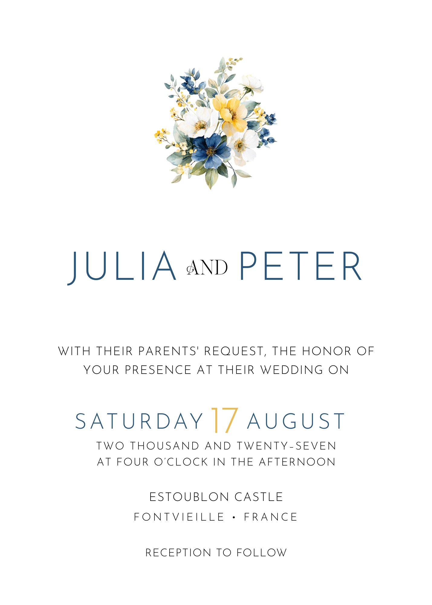
That became the foundation for French Blue: a muted, slightly weathered blue paired with elegant typography and botanical details that suggest the French countryside without illustrating it outright. The result feels French in a much quieter way.
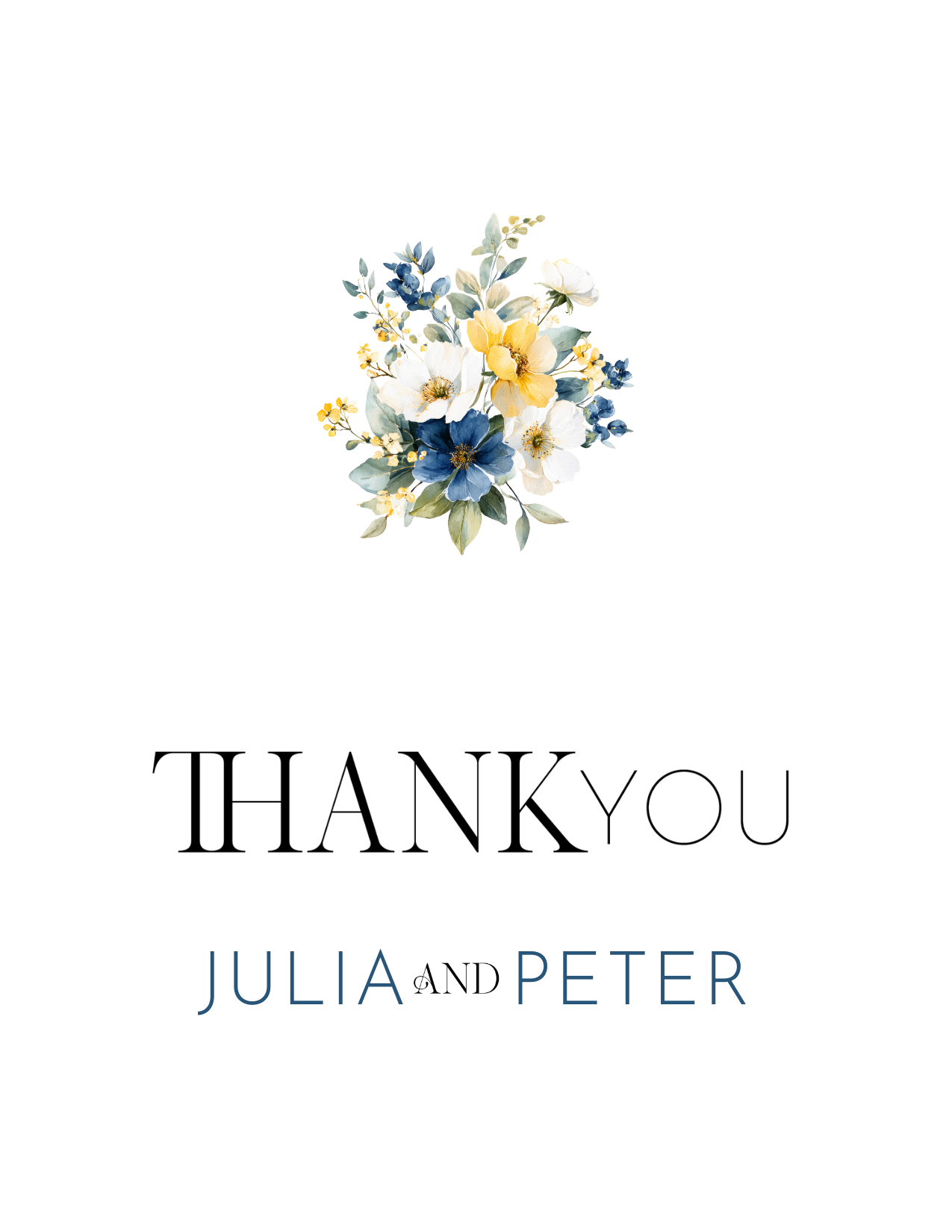
Font: Splendor Escape
French Blue
Getting to that particular blue took longer than I expected. I looked at dozens of references: faded shutters on old farmhouses, the blue-grey of weathered wood, the tone that appears in antique French porcelain once the glaze has softened with age. Most reference blues I found were either too saturated (more Mediterranean postcard than lived-in countryside) or too cold, closer to a corporate navy than anything you'd find painted on a door in the South of France. I wanted a blue that looked like it had been there a while, the kind of color that comes from sun and salt air and decades of repainting rather than a fresh coat straight from the store.
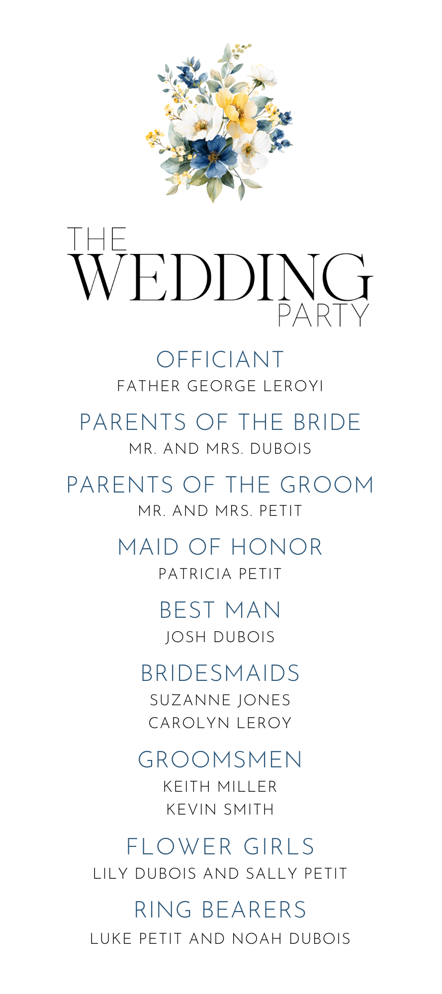
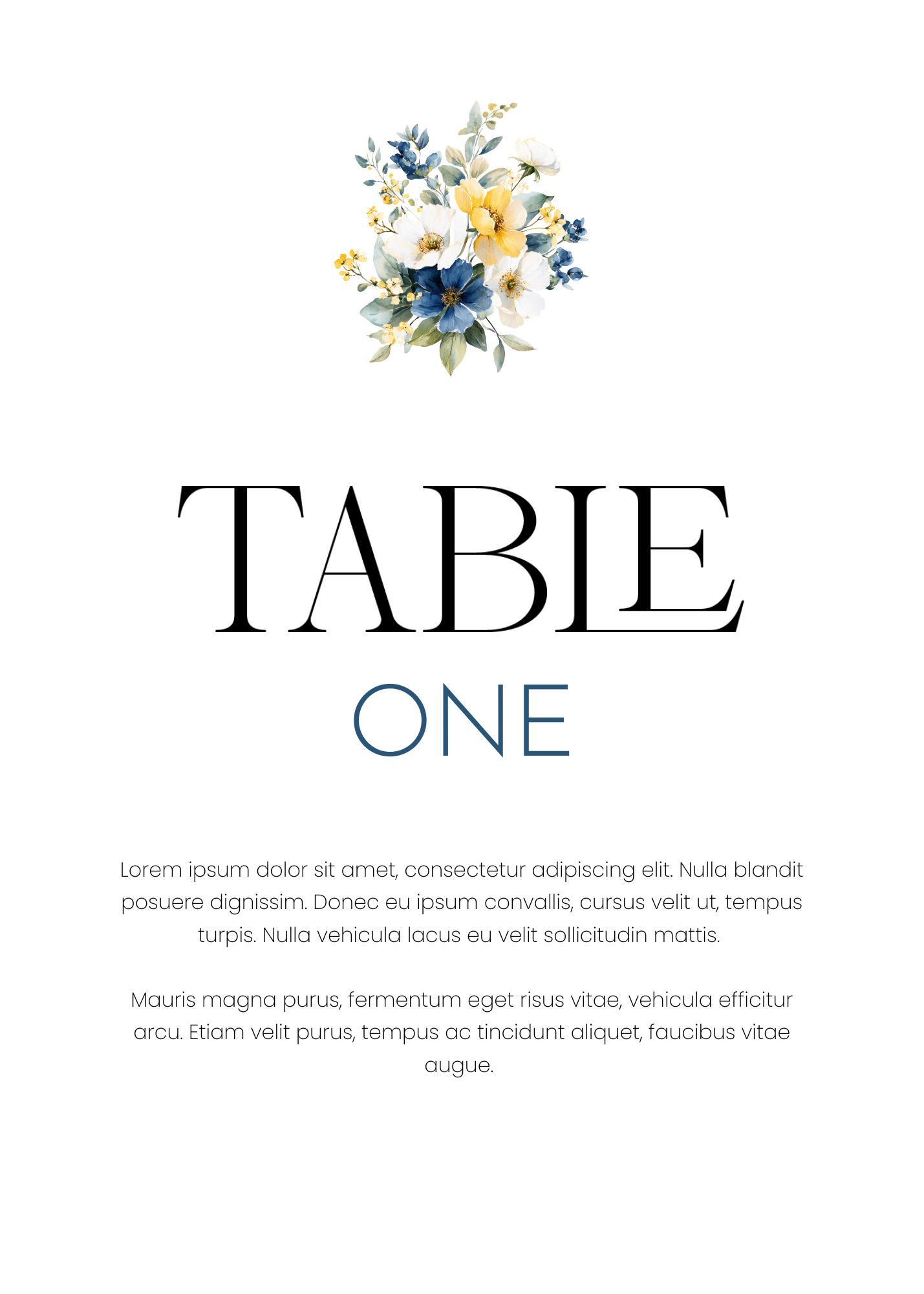
Once I landed on the right shade, the rest of the palette fell into place around it: crisp white paper as the backdrop, a touch of aged gold for accents, and soft watercolor botanicals kept loose and understated rather than dense or saturated. Nothing in the collection was meant to shout. Every element was chosen to support that one quiet blue.
Why Do Obvious Symbols Weaken a Design?
There's nothing wrong with lavender. I love lavender. But as a designer, the most obvious choice is often the one I need to eliminate first.
When a flower, color, or image becomes strongly associated with a place, it starts doing all the storytelling for you. Instead of creating an atmosphere, you end up assembling symbols:
- Provence? Add lavender.
- Tuscany? Add lemons and a villa.
- Coastal? Add seashells.
Before long, the design becomes a theme instead of a point of view. That isn't what I wanted for the Heritage Collection.
The Day of Stationery
How Does Restraint Show Up in French Blue?
One of the things I love most about traditional stationery is its restraint: beautiful paper, thoughtful typography, a carefully chosen color, artwork that supports the words instead of competing with them. French Blue follows that same philosophy.
It doesn't need a field of lavender to tell you where its inspiration came from. The color, typography, and botanical elements do that more subtly, and subtlety gives a couple room to make the stationery their own.
This is something I come back to with almost every collection I design, not just French Blue. A heavy hand with symbols can make stationery feel more like a costume than an invitation. When every element is working to prove where the inspiration came from, there's no room left for the couple's own personality to come through. Restraint isn't the absence of a point of view. It's what lets the point of view actually be seen instead of getting buried under decoration.
Would French Blue Work Outside Provence?
Yes. A French Blue invitation could absolutely introduce a wedding in Provence, but it would feel just as natural at an old estate, a garden wedding, an intimate celebration at a beautiful restaurant, or a ceremony somewhere that has never seen a lavender field. That versatility matters to me.
What's the Takeaway for Inspiration-Driven Design?
Inspiration can come from a place, an era, a flower, a piece of architecture, or even a memory. But a finished design doesn't have to contain every recognizable element of its source. Sometimes leaving something out is what makes the design work.
French Blue didn't need lavender. It needed the feeling I remembered: softness, warmth, faded color, and effortless elegance. Once I stopped trying to show Provence, I could simply let the collection feel French.
Perhaps that's why French Blue has become one of my favorite Heritage Collections. It isn't trying to recreate Provence. It simply borrows a little of its spirit. No lavender fields required.