
When couples first discover the Heritage Collection wedding stationery suites, they often notice the colors, the envelopes, or the romantic styling.
What they don't always notice immediately is the one thing that took the longest to create.
The typography.
Ironically, it's also the reason the collection exists at all.
It Started Long Before Canva Templates
I began my stationery business in 2001, long before editable wedding invitation templates became commonplace.
Back then, every invitation was built by hand. Layouts were assembled piece by piece. Type was carefully chosen, adjusted, and refined. Every line mattered.
Typography wasn't an afterthought.
It was the design.
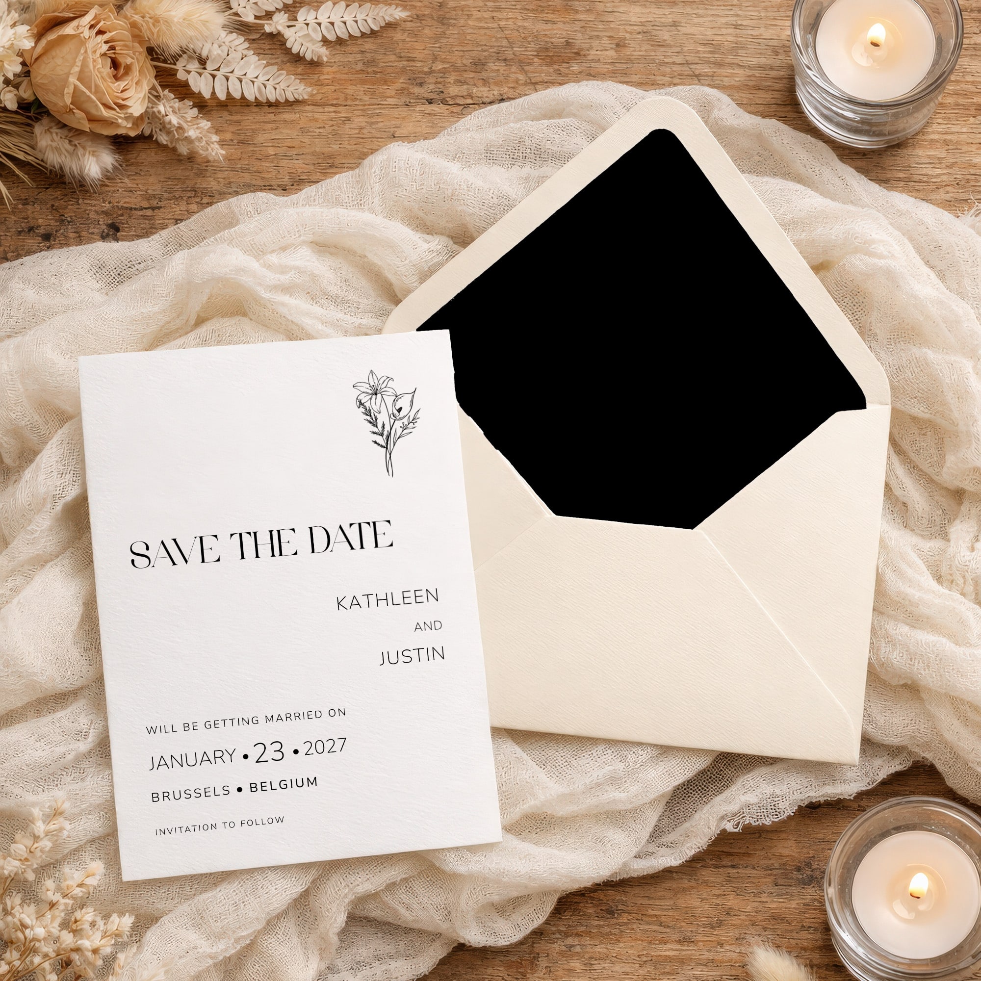
I learned early in my career that beautiful invitations are rarely defined by illustrations or decorative flourishes alone. What creates elegance is often much more subtle.
It's the space between letters.
The way a capital swash flows into the next word.
The rhythm created by a thoughtfully chosen typeface.
These details are almost invisible when they're done well, yet they're often the difference between something that feels ordinary and something that feels timeless.
The Problem with Most Wedding Invitation Templates
As I transitioned into creating editable Canva wedding invitation templates, I quickly discovered a problem.
Most templates rely entirely on the fonts available inside Canva.
There's nothing inherently wrong with that. Canva offers many excellent fonts.
But typography enthusiasts know that beautiful lettering is often more than selecting a font from a menu.
Many of the most elegant title treatments require custom ligatures, hand-adjusted spacing, alternate character forms, and refinements that simply don't survive when a customer changes a font with a single click.
The very details that create sophistication are often the first things to disappear.
I didn't want that to happen.
A Different Approach to Wedding Stationery Design
Instead of building the decorative titles directly in Canva, I began creating them separately in Adobe Illustrator using premium licensed fonts you won't find in Canva's font library.
Each title was treated like a piece of artwork rather than editable text.
I adjusted letter spacing manually.
I refined connections between characters.
I experimented with alternate forms until every title felt balanced and intentional.
Only then were the finished titles — saved as high-resolution 300 dpi PNGs — brought into the invitation designs.
This approach required significantly more work.
But it preserved something important.
The typography.
Why Ligatures Matter in Wedding Stationery
If you've followed my work, you've probably heard me mention ligatures.
Designers love talking about them.
Most people have never heard the term.
Yet everyone notices the result.
A ligature occurs when two or more letters are designed to flow together rather than standing separately. The effect is subtle, but it creates a smoother and more refined reading experience — something that matters enormously in fine wedding stationery.
Think about the difference between a handwritten signature and block printing.
One flows.
The other simply exists.
The decorative titles throughout the Heritage Collection were designed with that sense of flow in mind.
Not because couples will identify the ligatures.
But because they'll feel the elegance.
Balancing Customization with Design Integrity
One of the biggest challenges in creating editable wedding invitation templates is balancing flexibility with design integrity.
I want couples to personalize their wedding stationery.
They should be able to change colors, update wording, and adapt the pieces to fit their celebration.
At the same time, I don't want the design foundations to accidentally fall apart.
That's why the decorative titles remain artwork.
Couples can customize almost everything around them — colors, fonts for names and dates, all the editable text — while preserving the typography exactly as it was intended.
It's a deliberate decision.
And one rooted in years of professional design experience.
More Than Invitations
Today, the Heritage Collection includes complete wedding stationery suites, from Save the Dates and invitations to menus, programs, place cards, welcome signs, and more.
But underneath every suite — whether it's Sage Green, French Blue, Espresso, Southern, or English Garden — is the same philosophy.
Good design isn't decoration.
Good design is communication.
Typography communicates mood, personality, sophistication, and emotion long before a guest reads a single word.
It quietly sets expectations.
It tells a story.
The Soul of the Collection
When couples ask what makes the Heritage Collection different from other Canva wedding templates, the answer isn't the paper size, the layout, or even the color palette.
It's the care hidden in the details.
The hours spent refining letterforms in Adobe Illustrator.
The pursuit of balance.
The decision to preserve beautiful typography in a world increasingly focused on speed and convenience.
Because long after trends change and color palettes evolve, beautiful letterforms remain timeless.
And timelessness has always been what these designs were made to achieve.
Explore the full collection of wedding stationery templates, thoughtfully designed as cohesive suites to carry your wedding from the first impression to the final detail.
0 Comments