Quick Answer: I chose MonteCarlo for the Tuscan Collection for its contrast between thin and medium-weight strokes and the way its distinctive letterforms can become part of the design rather than just spelling out the words. Paired with the clean simplicity of Josefin Sans and Playfair Display used sparingly for the couple's names, it gives the collection a refined, romantic character without overwhelming the delicate orange blossom artwork.
Why a Font Called MonteCarlo for a Tuscan Collection?
Yes, I know. Monte Carlo isn't in Italy.
It's in Monaco, and Monaco's official language is French. So why would a typeface called MonteCarlo end up anchoring a wedding stationery collection inspired by Tuscany?
Because I don't choose fonts by their names. I choose them by how they feel, how they work with the artwork, and how the letters behave together on the page. A font's name tells you what the type foundry decided to call it. It doesn't tell you anything about whether it belongs in your design.
MonteCarlo gave me exactly what Tuscan needed, and honestly, that's the only qualification a typeface needs to earn a place in a collection.
What Made MonteCarlo the Right Weight for This Artwork?
What first drew me to MonteCarlo was the contrast between its very thin strokes and its more substantial ones. It has presence without feeling heavy. Some letters turn dramatic, almost sculptural, while others thin out until they nearly disappear into fine lines.
That balance felt right for this collection. The artwork already carries softness: white orange blossoms, greenery, small touches of warm orange. I didn't want a typeface competing with it for attention, and I didn't want something so delicate that the typography got lost against the illustration.
MonteCarlo could hold its own next to that artwork without shouting over it, and more importantly, it gave me something to actually design with. That distinction matters more than it sounds. A lot of fonts can coexist peacefully with artwork. Far fewer can become part of the composition itself.
What Should a Typeface Do Beyond Spelling the Words?
Choosing a font isn't just deciding what the words look like. It's deciding what you can do with them, and that's where most font-pairing advice stops short. It tells you which two typefaces look nice together. It rarely talks about what you can build once you have them.
With MonteCarlo, the individual letterforms opened up different compositions depending on the piece:
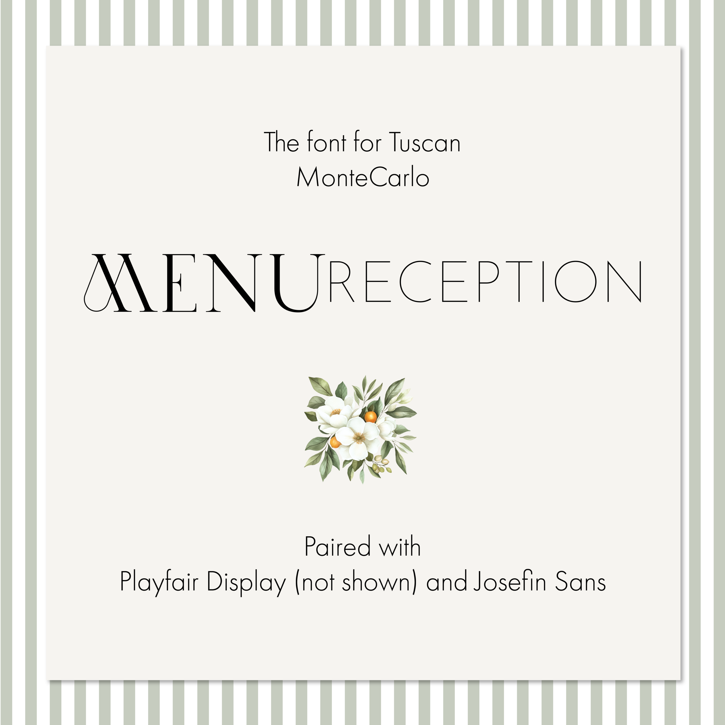
- On the menu, MENU RECEPTION becomes almost a piece of artwork itself, with the dramatic letters carrying the composition while the finer characters add contrast underneath them.
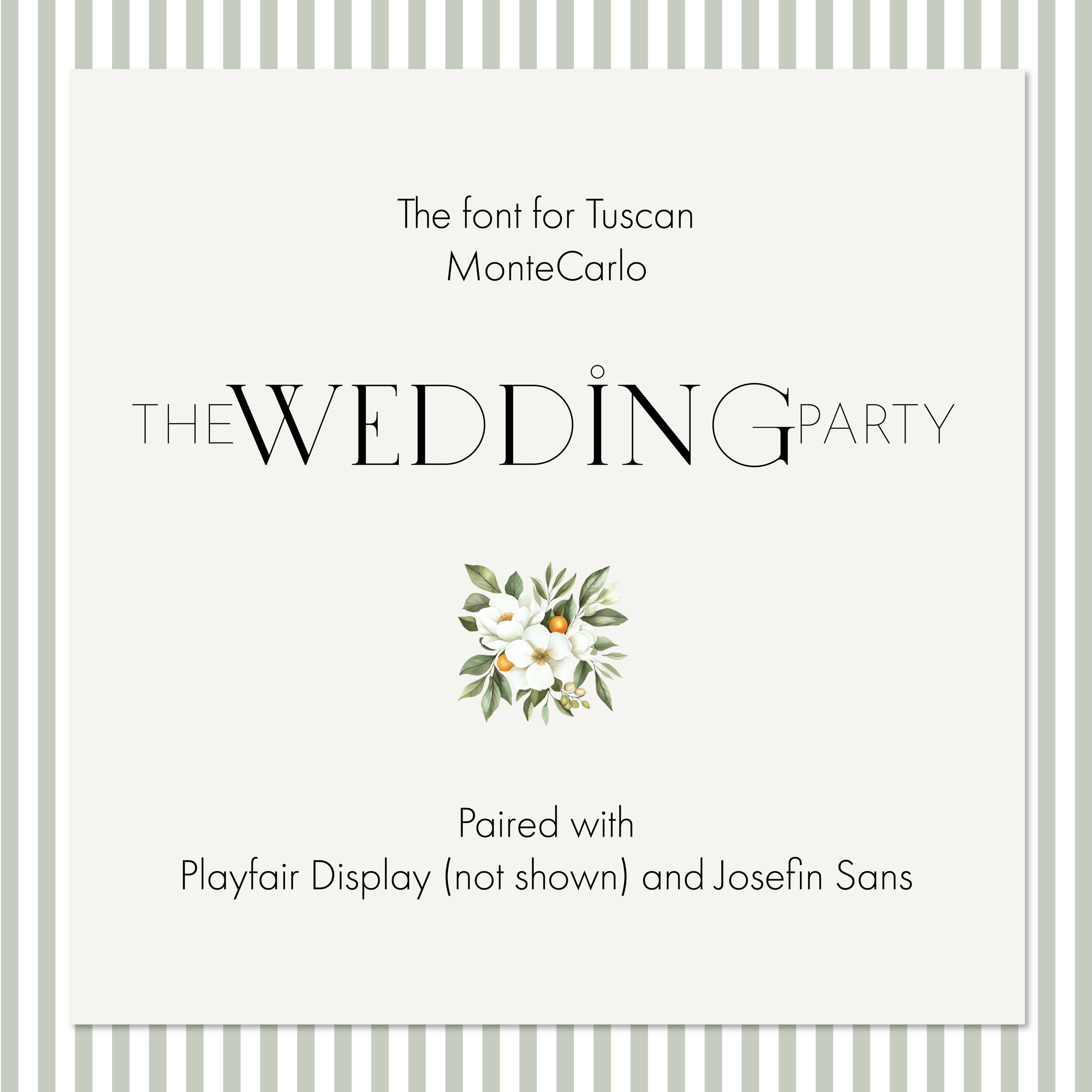
- On THE WEDDING PARTY, the relationship between the large, substantial letters and the incredibly fine ones creates a completely different rhythm, more playful and a little unexpected.
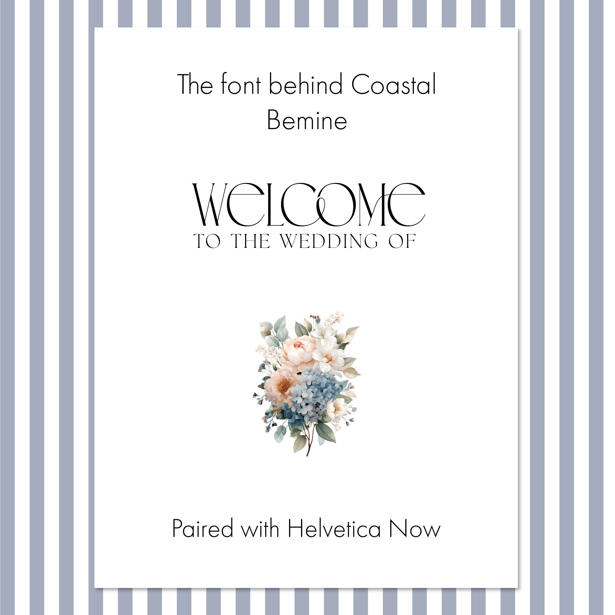
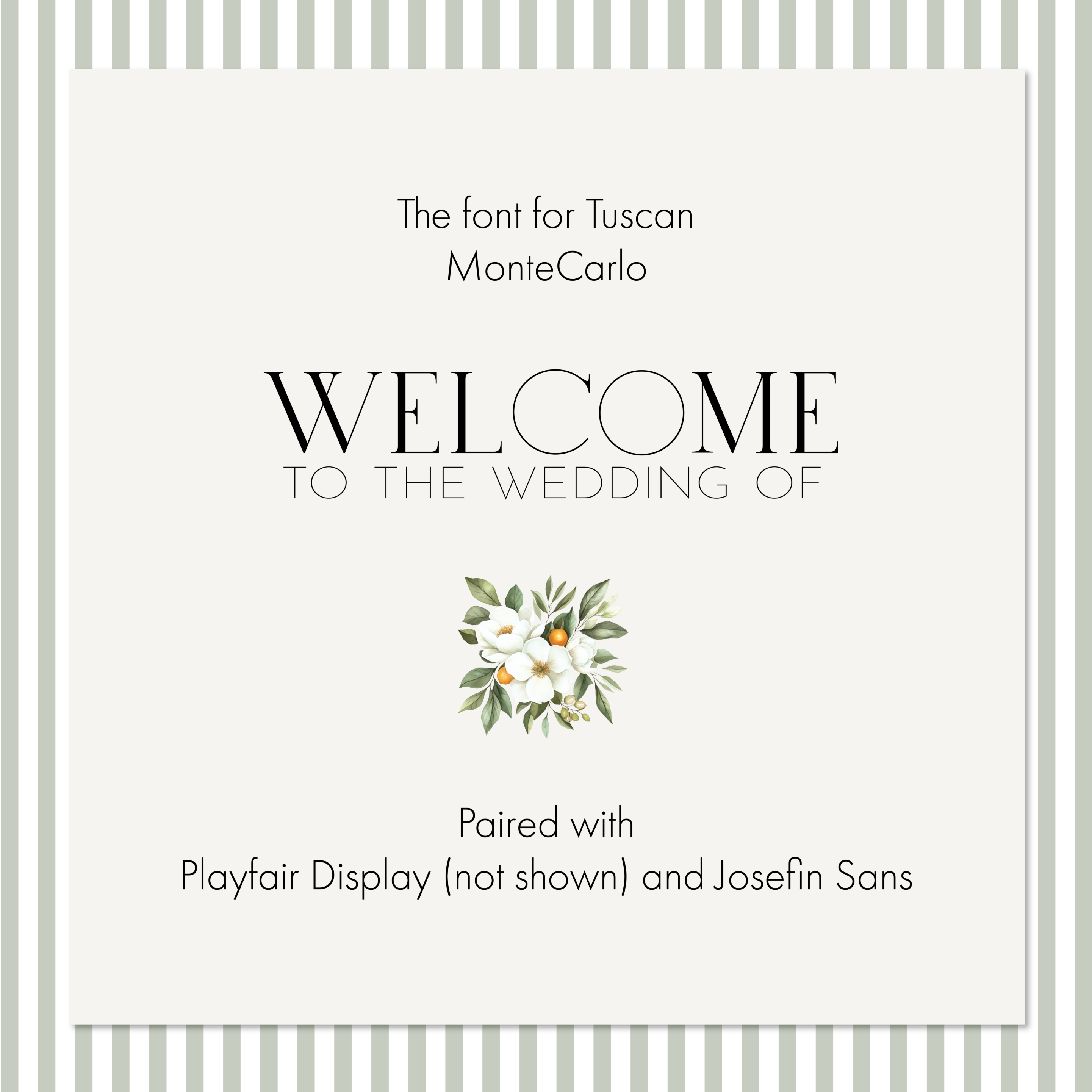
- On WELCOME TO THE WEDDING OF, the same typeface turns quieter and more restrained, letting the greeting do its job without competing with the floral artwork beneath it.
Same font, same collection, three distinct personalities. That range is exactly what I was after when I picked MonteCarlo in the first place. A typeface that can only do one thing well is a typeface you'll outgrow by the second piece in a suite. One that can shift character depending on scale, spacing, and which letters carry the emphasis will carry an entire collection.
Why Pair MonteCarlo with Josefin Sans?
MonteCarlo needed a partner that wouldn't compete with it. Josefin Sans, with its clean geometry and fine strokes, sits comfortably beside MonteCarlo's more expressive forms. Where MonteCarlo draws the eye, Josefin Sans steps back and does its job quietly in the background, handling the supporting text without asking for any of the attention.
That's the part of type pairing people often miss: both fonts don't need to be interesting at the same time. In fact, they usually shouldn't be. If two typefaces both fight for the reader's attention, the page ends up feeling busy and unresolved no matter how well either one is drawn on its own. Sometimes the best partner is the one that knows when to be quiet, and Josefin Sans knows exactly when that is.
Where Does Playfair Display Fit In?
There's a third typeface in the Tuscan Collection, though you won't see it in the examples shown here. I use Playfair Display for the couple's names, and only the names.
Playfair has enough elegance and character to set the names apart from the surrounding typography, but using more of it would throw off the balance I'd already built with MonteCarlo and Josefin Sans. Three typefaces trying to share equal billing on one invitation suite is a crowded room. Giving Playfair one very specific, very limited job keeps it from becoming a fourth voice competing with the other two.
MonteCarlo is the voice of the collection. Josefin Sans supports it. Playfair Display has one job and does it well. That's enough. It doesn't need to do more than that to earn its place.
Does the Font's Name Actually Matter?
I could have ruled out MonteCarlo because Tuscany isn't Monaco. That would have been a silly reason to walk away from the right typeface, the kind of decision that looks tidy on paper and makes for a worse design in practice.
A font doesn't have to come from the place that inspired a design. It has to help tell the same story. For me, MonteCarlo had the refinement, lightness, and just enough drama to sit beside the orange blossoms and greenery of Tuscany without overwhelming them. That's the job. Where the name came from was never part of the job description.
It wasn't the Italian choice. It was the right design choice. And in the end, that's the only geography that really matters.