Standalone brand story post. Not tied to a specific Heritage Collection.
"Heritage" gets used loosely in the wedding stationery world. It shows up in taglines and product names, ours included, often to describe something that is a few years old at most. So it's worth pausing on a name that actually earned the word, over eight decades of continuous work: Mrs. John L. Strong.
If you've spent any real time around fine stationery, you've heard the name, even if you've never held one of her pieces. If you haven't, here's the short version, and why it still matters to how we think about our own Heritage Collection today.
Who She Was
Flora Strong opened her stationery business in 1929, in the immediate aftermath of the stock market crash, working out of a corner of her sister's trousseau shop on New York's Upper East Side. Within a few years, demand outgrew the space. She moved twice, eventually landing at 699 Madison Avenue, where the brand is still headquartered today. Everything Mrs. Strong made was done by hand: engraved dies cut into steel, ink mixed to custom formulas, envelopes lined and cards bordered one at a time. She even developed her own signature paper stock, a warm cream cotton shade that became as recognizable as her name.
The Standard She Set
The client list wasn't marketing copy. It was real. The Duke and Duchess of Windsor. Diana Vreeland. Jackie Kennedy. Seven presidential families, across generations. For eighty years, under Mrs. Strong and later under the owners who kept her methods alive after her death in 1979, that was what "heritage" meant in this industry: a standard of craft that never got shortcut, no matter how long the waitlist got.
Patti's Design Note
Not every invitation labeled "heritage" is inspired by historical stationery. We wanted ours to be.
The Gap Nobody Talks About
Here's the part that doesn't usually make it into the tribute pieces. That standard came at a real cost, and not just in dollars. Hand-engraved, fully bespoke stationery was built around a small circle of people who could wait weeks for an order and pay accordingly. The craftsmanship was genuine. The access to it never was. For every bride who could commission a custom die, there were thousands who loved that level of detail and had no path to it at all.
Where TACF Comes In
That gap is where we've tried to build something different, without pretending we're doing what Mrs. Strong did. We're not hand-engraving steel. We're doing something more modest and, we think, more useful: making sure the design work behind every Heritage Collection suite holds itself to a similar standard of "no shortcuts," even though the final product is digital and editable.
Behind the Design
Those little moments give the eye somewhere to rest.
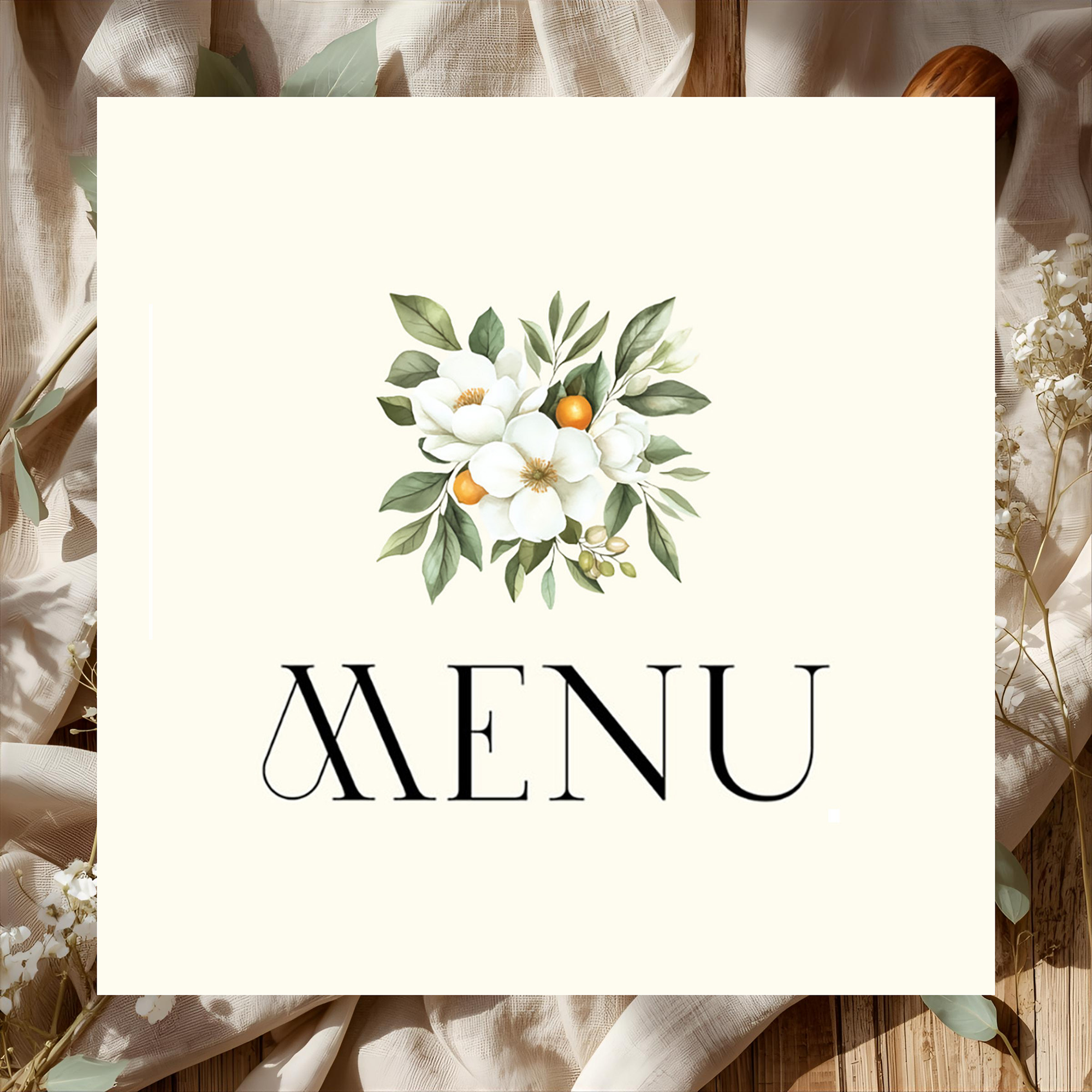
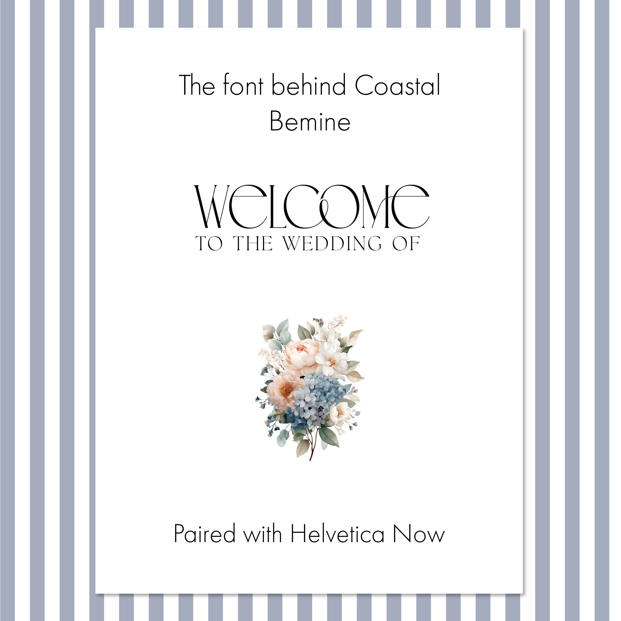
That's the whole idea behind what we call TACF, which stands for These Aren't Canva Fonts. Every collection in the Heritage line starts with a title typeface that's hand-designed in Adobe Illustrator, using a licensed font with hand-selected ligatures, then exported and built into the template as fixed artwork. It's a small, unglamorous step that most people will never notice, and it's exactly the kind of step that separates a suite that looks considered from one that looks like everyone else's Pinterest board. It's not steel engraving. But it comes from the same instinct: care about the part no one will check.
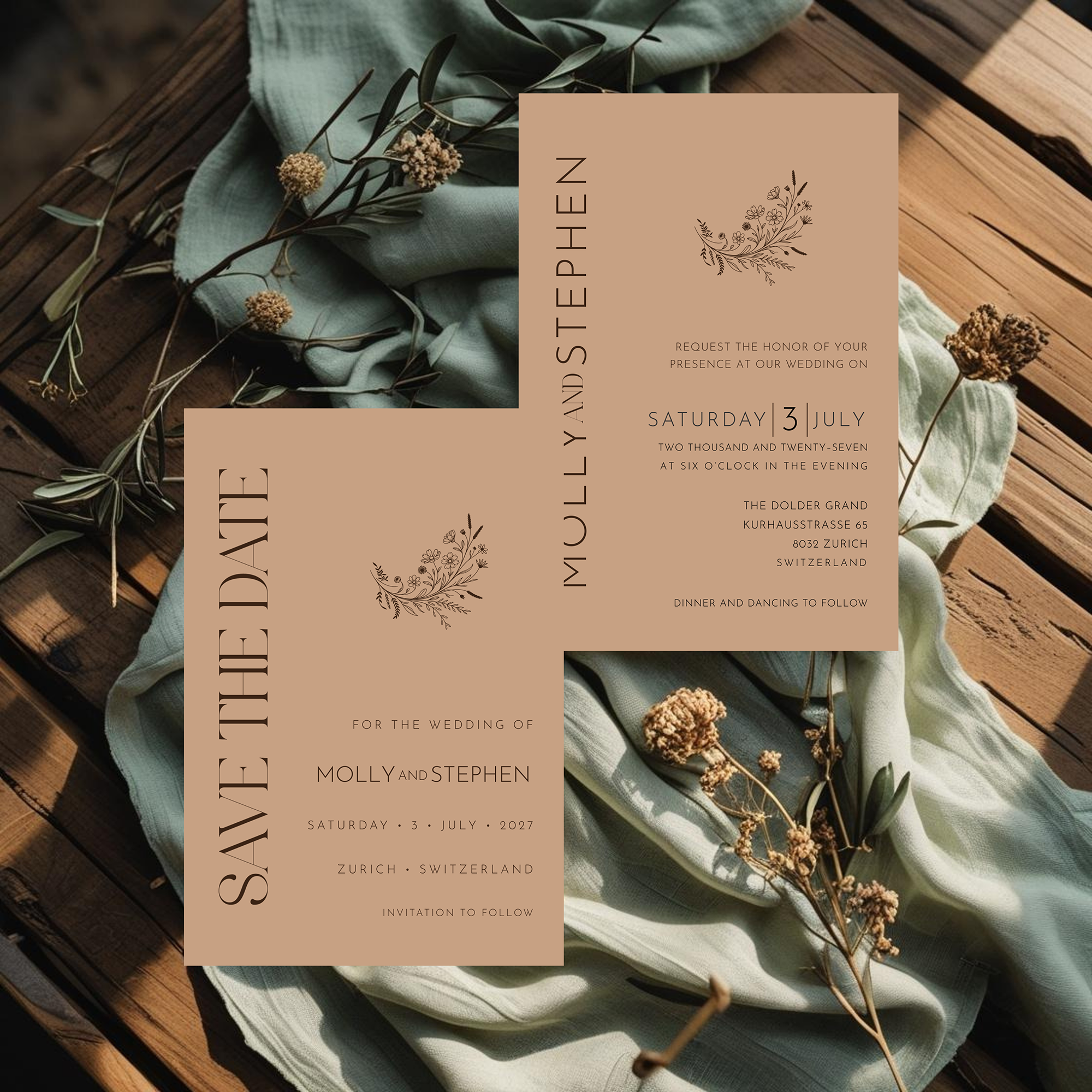
Typography is only half of it. The other non-negotiable is the motif work: the botanical line art, wreaths, and small illustrated details that dress each suite. Every Heritage Collection motif is chosen and placed by hand for that specific collection's mood, rather than pulled from a generic clip-art library, the same way Mrs. Strong's engraved crests and monograms were designed around the specific client rather than stamped on from a catalog. It's a small thing to notice on a scroll through Pinterest, but it's the difference between a suite that feels considered and one that feels assembled.
Frequently Asked Questions
Bring Heritage Style to Your Wedding
Explore the complete Heritage Collection, from Save the Dates to menus, designed to feel timeless from the very first impression.