Long before logos became status symbols, there was the monogram.
A simple arrangement of letters could identify a family, celebrate a marriage, or quietly announce elegance without saying a word. It was never decoration for decoration's sake. A well-designed monogram carried history, craftsmanship, and identity in just a few carefully drawn lines.
Today, monograms are everywhere. They are embroidered onto linens, stamped into leather, engraved on jewelry, and printed across wedding stationery. Somewhere along the way, a lot of them lost the artistry that made them special in the first place.
More Than Just Initials
Anyone can type three letters into a script font and call it a monogram. Designing one is something else entirely.
A successful monogram is not about squeezing initials together and hoping they land. It is about balance between positive and negative space, letters that intertwine naturally while staying readable, and a shape that feels intentional at every curve and connection point. The best monograms almost look inevitable, as if the letters were always meant to exist together. That effect is much harder to achieve than it looks.
What the Great Stationers Understood
The stationers who built lasting reputations treated monograms as miniature works of art. Whether embossed into heavy cotton paper or engraved onto personal stationery, a family's mark became instantly recognizable and often appeared on correspondence for generations, long before anyone called it personal branding.
Their monograms worked because of restraint. No unnecessary flourishes competing for attention. Every stroke earning its place. That same philosophy still shapes good stationery design today, and it is the standard I hold myself to when I sit down to draw one.
Why Some Monograms Feel Timeless and Others Don't
Trends come and go. We have all seen the oversized script monograms that instantly date themselves to a particular decade. At the time, they felt fresh. A few years later, they read exactly like what they are: a trend that has passed.
Timeless monograms work differently. They rely on proportion instead of decoration, contrast instead of excess, and they let the personality of the letters themselves carry the design. Done well, a monogram feels just as elegant twenty years from now as it does the day it is drawn.
A Wedding's Personal Signature
For a lot of couples, a monogram becomes far more than a mark on the invitation suite. It shows up on welcome signs, cocktail napkins, menus, favor tags, thank you notes, and eventually on the home a couple builds together after the wedding is long over. That kind of staying power is exactly why it deserves more thought than picking a decorative font off a dropdown menu. A well-built monogram becomes a visual signature that follows a couple through every stage of their life together.
Looking Beyond Templates
Technology has made custom stationery more accessible than it has ever been, and that is genuinely worth celebrating. But accessible should not mean generic. A memorable monogram is not created by clicking a button. It comes from understanding typography, letterforms, spacing, and how individual characters can interact to create something that did not exist before you drew it.
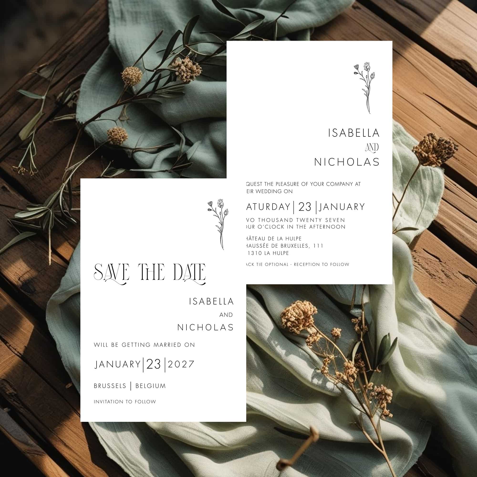
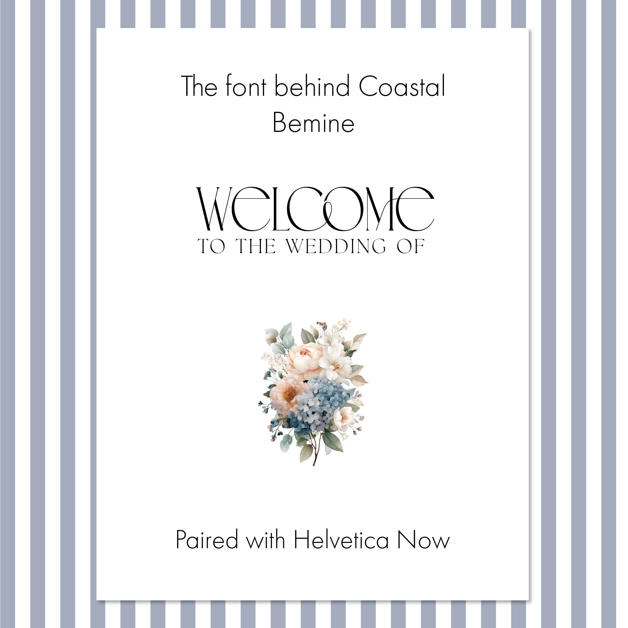
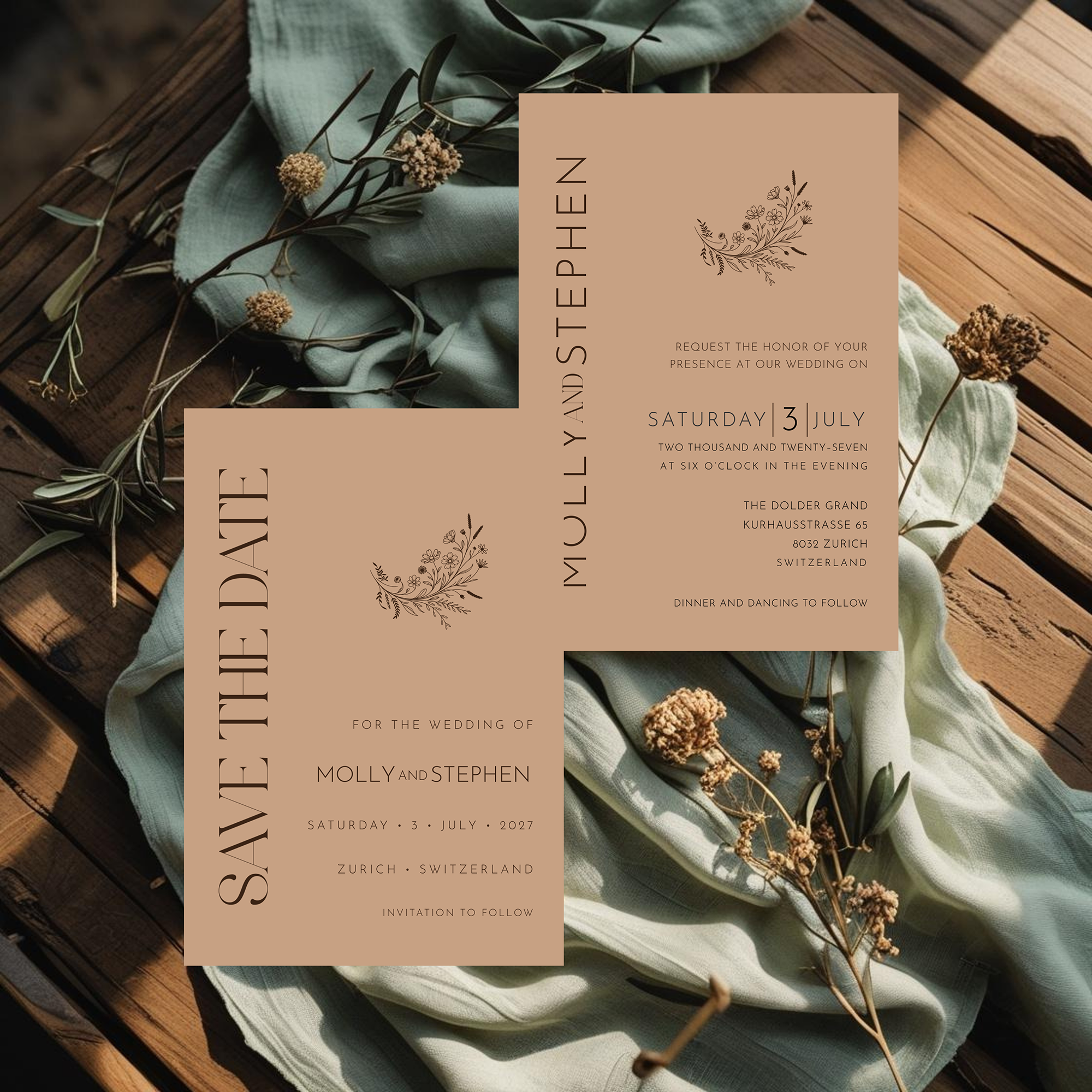
That is where design becomes craft, and it is the same principle behind every piece of the Heritage Collection. Every decorative letterform I use starts from a licensed font, then goes through hand-selected ligatures, careful kerning, and custom spacing in Illustrator, built letter by letter for that specific combination rather than pulled from a font menu and dropped onto a page as is. Monograms belong to that same standard.
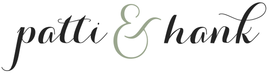
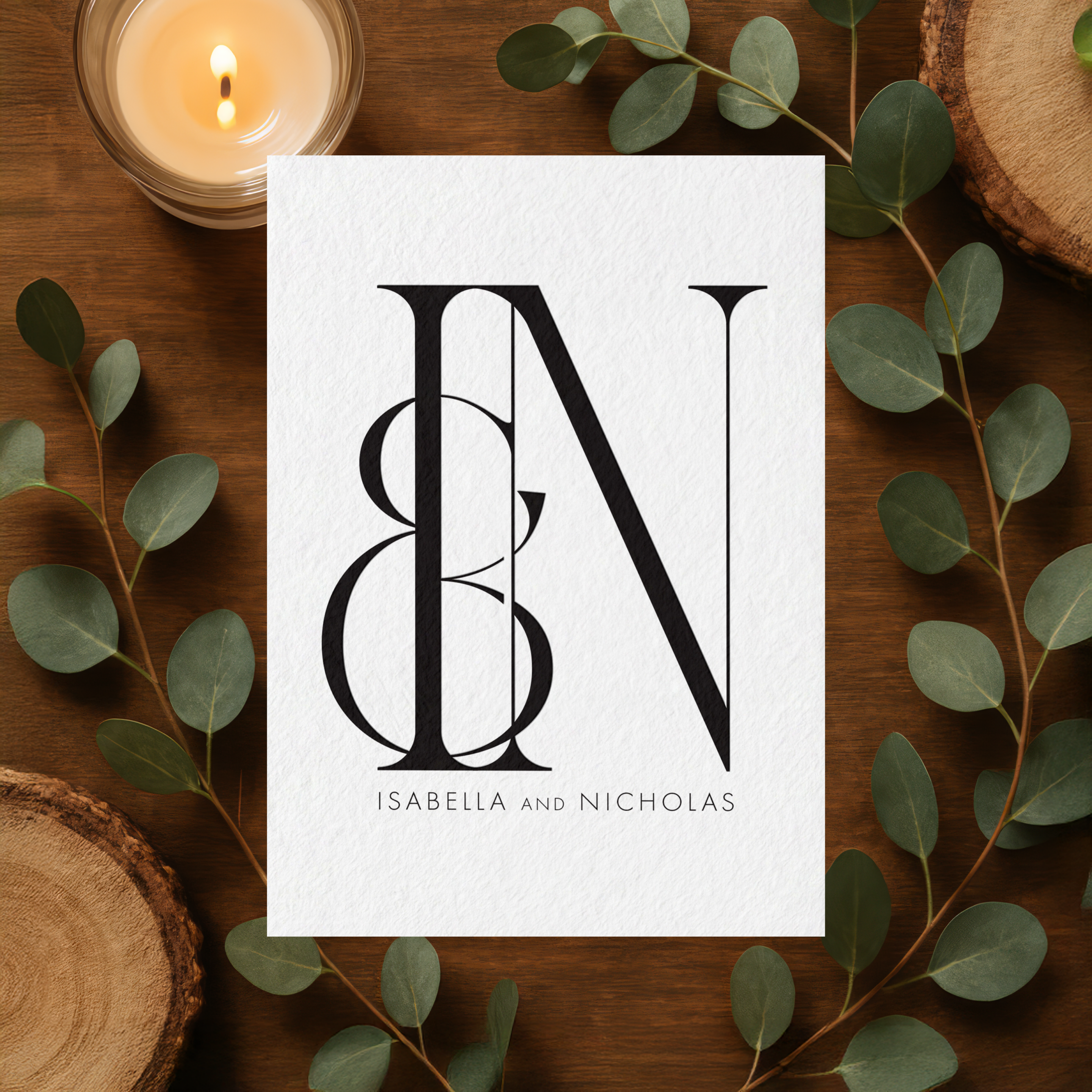
The Black and White monogram featured above is one example. It starts from a licensed decorative font, then goes through hand-selected ligatures and custom kerning until the letters interlock as one distinctive mark rather than sitting side by side as separate characters.
The smallest design choices are usually the ones people remember most. A graceful ligature. A perfectly balanced curve. Two letters that seem to lock together without effort. Those details rarely announce themselves, but they are what separate a piece of stationery someone keeps for years from one that gets forgotten by the following week.
Starting with this post, I am building out a monogram series here on the blog, and I will be designing original monogram artwork to go with it, in the same custom-built spirit as the Heritage Collection lettering. The art of the monogram has never really disappeared. It just needs designers who still treat it like one.
Frequently Asked Questions
The art of the monogram never really left.
It just needed someone to slow back down for it.