
There’s a reason so many wedding invitations feel slightly off—even when each individual piece is beautiful.
It’s not the paper.
It’s not the color.
And it’s rarely the font on its own.
It’s the lack of connection between everything.
Most couples approach their stationery one piece at a time. A save the date is chosen here, an invitation there, and later a menu or program is added to match “as best as possible.” Each decision feels right in the moment—but together, they don’t quite hold.
The result is a collection of pieces rather than a cohesive suite.
Where It Starts to Break Down
The disconnect usually comes from three areas:
- Typography shifts
Fonts change slightly from piece to piece, or hierarchy isn’t maintained. What felt elegant on the invitation becomes inconsistent across the suite. - Inconsistent spacing and structure
Margins, alignment, and proportions are rarely replicated exactly—especially when mixing templates. - Color drift
Even subtle variations in tone or balance can create visual tension when pieces are placed side by side.
Individually, these details are easy to overlook. Together, they create a sense that something isn’t quite finished.
What Cohesion Actually Looks Like
A cohesive suite doesn’t rely on decoration—it relies on structure.
- The same typographic system carries across every piece
- Spacing and alignment feel intentional and repeated
- Each item looks like it belongs to the same design language
It’s less about matching and more about continuity.
Designed to Remove the Guesswork
At Patti & Hank, every collection is built as a complete system—not a set of individual templates.
Each piece is designed alongside the others, ensuring that nothing needs to be adjusted, matched, or reinterpreted later.
Because when the structure is already in place, the entire experience feels effortless.
Frequently Asked Questions
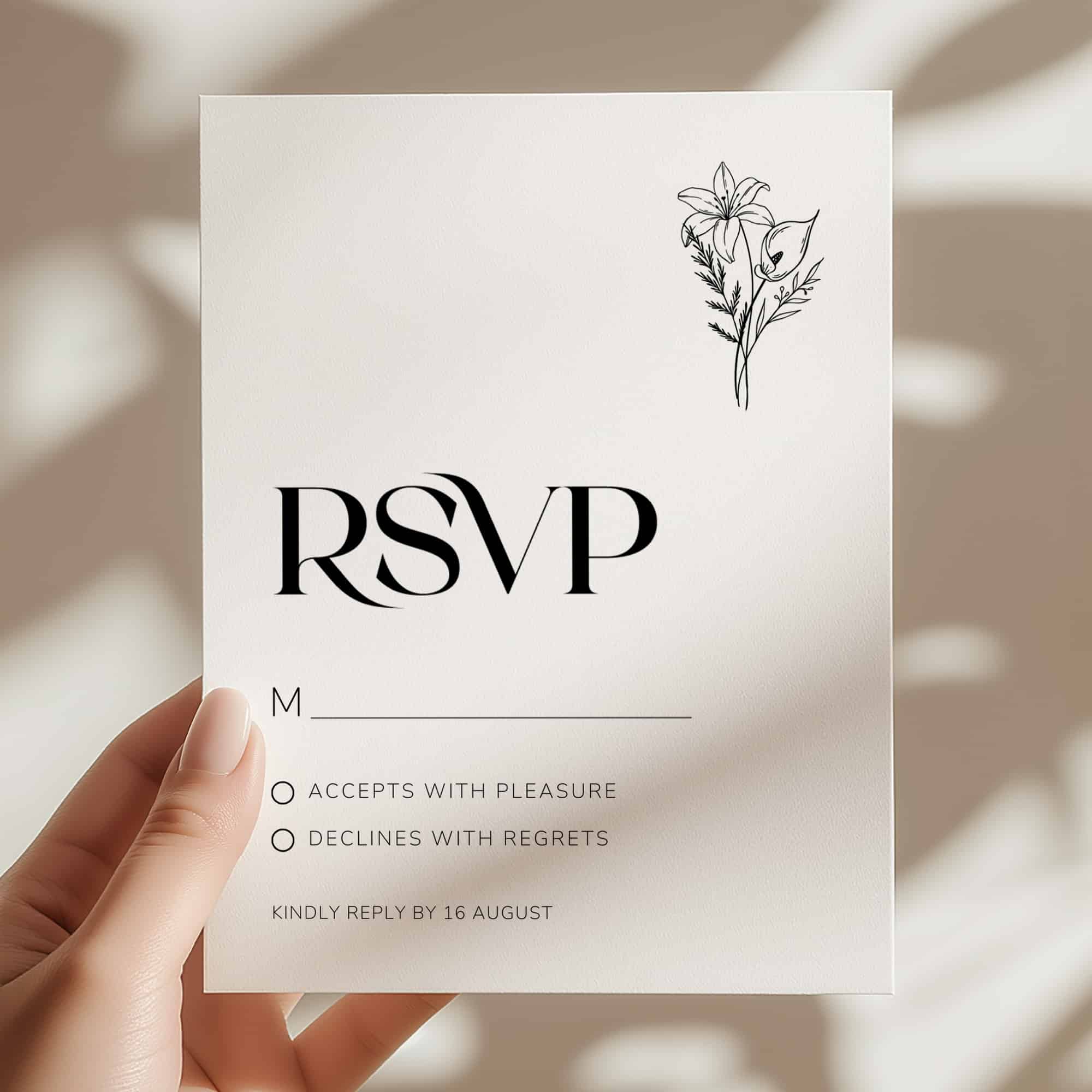
Explore the full collection of wedding stationery templates, thoughtfully designed as cohesive suites to carry your wedding from the first impression to the final detail.
0 Comments