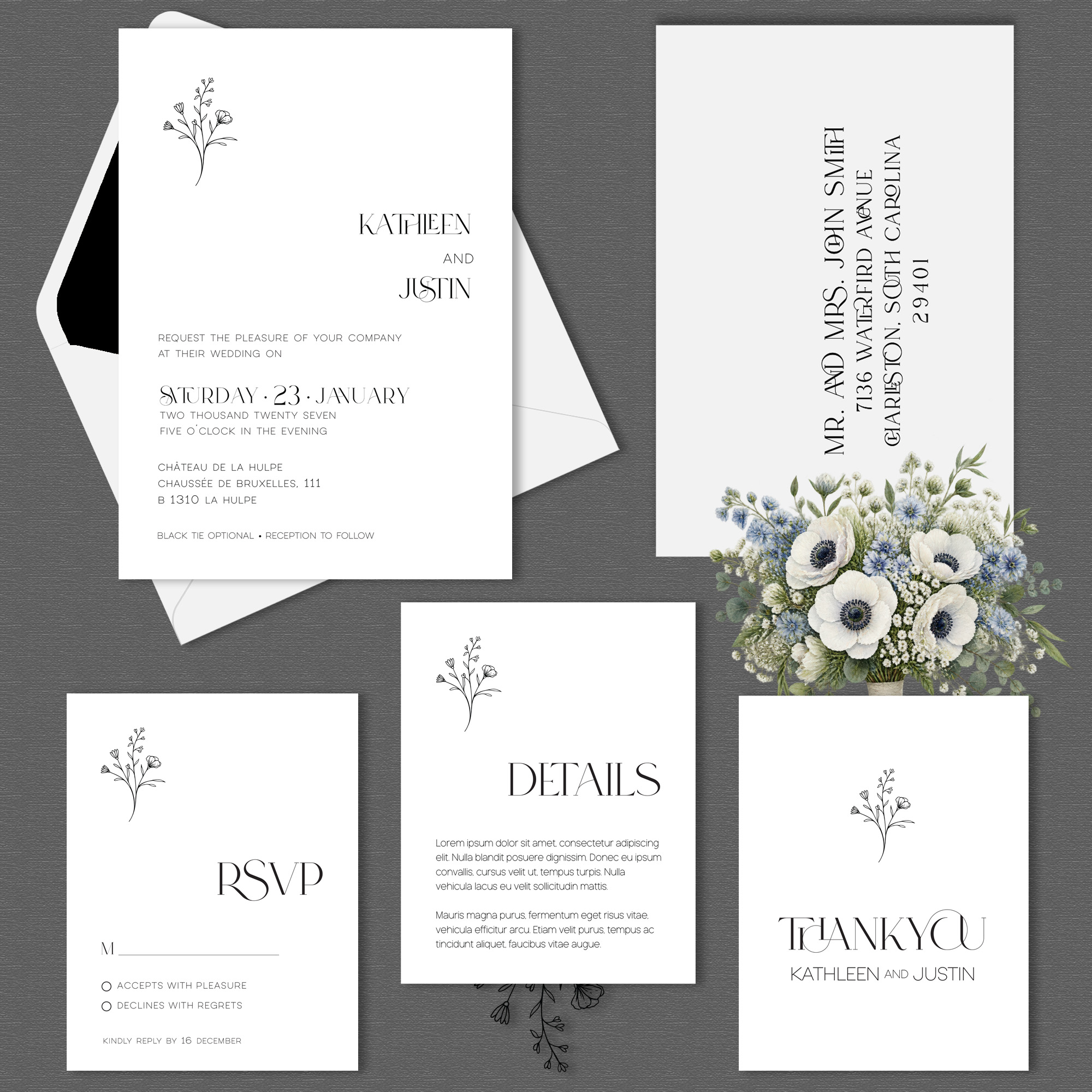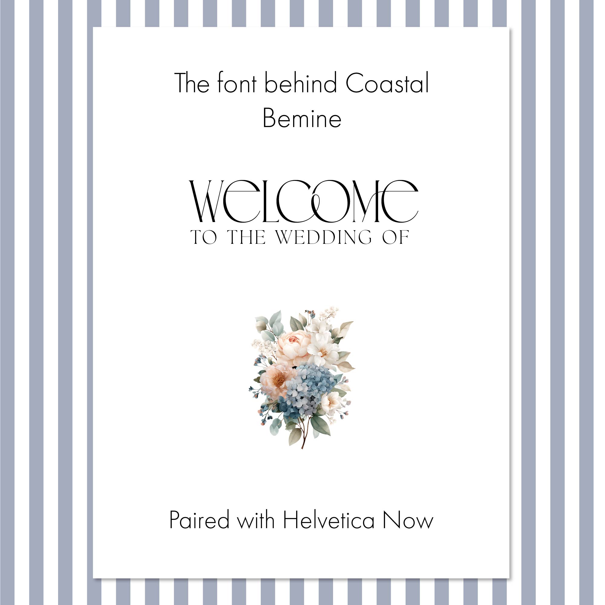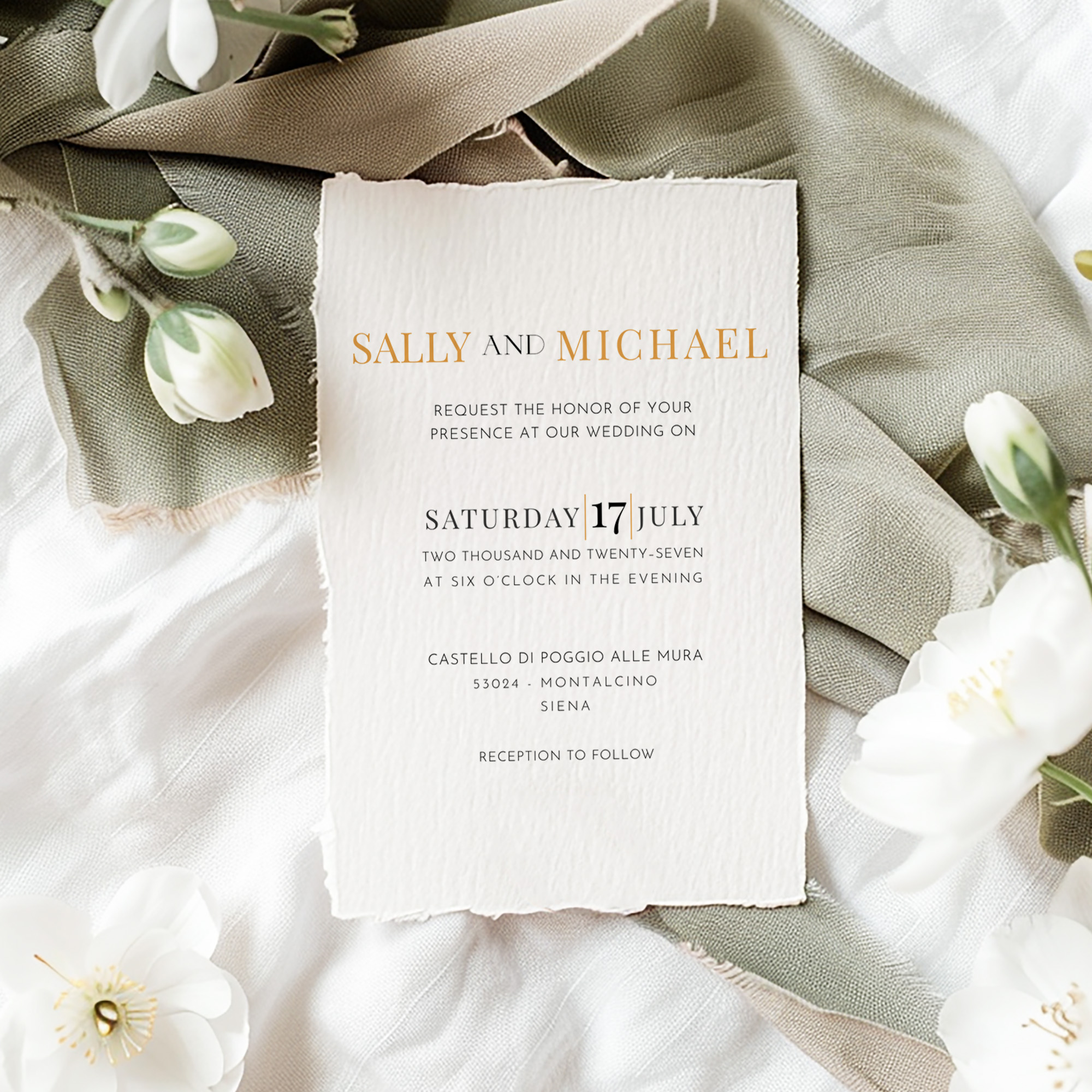
Quick Answer: Wedding invitations often use more than one font because each part of the invitation has a different job to do. One typeface brings personality and emphasis to the couple's names, while another makes the date, location, and other details easy to read. The goal isn't more fonts; it's better hierarchy: guiding the eye to what matters first, second, and third.
Why Does Typography Matter So Much on a Wedding Invitation?
When people look at a wedding invitation, they usually notice the design first. The flowers. The color palette. The monogram. The couple's names.
But typography is doing an enormous amount of work behind the scenes, often before a single word is consciously read.
A delicate script feels romantic and personal. A traditional serif suggests formality and history. A clean sans serif makes an invitation feel contemporary and understated. Sometimes the most beautiful choice is a combination of all three.
That's why you'll rarely find a single font used at the same size and weight throughout an entire piece of wedding stationery. Different information deserves different treatment.
Why Should the Couple's Names Get Their Own Typeface?
On most wedding invitations, there's a natural focal point: the couple. Their names should feel important, and this is where an expressive typeface, a script, an elegant serif, or another distinctive style, can do real work.
But an expressive font doesn't belong everywhere else on the page.
Imagine an entire invitation set in one elaborate script. The names might look beautiful, but now the date is competing with them. So is the venue. So are the reception details. Nothing has hierarchy, because everything is demanding the same amount of attention.
Instead, the distinctive typeface gets its moment, and the supporting typography goes quiet around it.
An expressive font doesn't belong everywhere else on the page.
What's the Job of the Supporting Font?
Wedding stationery isn't only decorative; it communicates information. Guests need to know when the wedding is happening, where to go, what time to arrive, and sometimes what to wear or where to stay. That information needs to be easy to read.
This is why an expressive typeface is often paired with a more restrained serif or sans serif. The supporting font doesn't have to be boring, a beautifully drawn, understated typeface adds plenty of character. It simply doesn't need to be the loudest voice in the room.
How Does Font Choice Create Visual Hierarchy?
Good typography guides the reader through an invitation without them having to think about where to look. The eye moves naturally: the couple's names first, then the wedding date, then the ceremony location, then the smaller details.
That progression isn't accidental. It's built through font choice, size, weight, capitalization, spacing, and placement. Sometimes that means using the same typeface in several places but changing its size or weight. Other times it means introducing a second typeface because the design needs contrast.
The goal isn't to use more fonts. The goal is to create order.
That progression isn't accidental. It's built through font choice, size, weight, capitalization, spacing, and placement.
Does Font Weight Really Make a Difference?
Regular. Medium. Semibold. Bold. Light. These may all belong to the same font family, but they create remarkably different impressions.
Lighter font weights often work best in wedding stationery because they let the typography feel elegant without overpowering the artwork. A heavier weight can be useful for emphasis, but too much of it quickly changes the character of a design, and the difference can be subtle on a font menu and surprisingly dramatic once the type is sitting on an invitation.
That's also why something shouldn't automatically go bold just because it's important. Scale, spacing, position, contrast, and white space can all create emphasis without adding weight.
Why Not Just Use Whatever Font Is Trending?
Wedding stationery has trends just like fashion and interiors. A certain script suddenly appears everywhere. A particular serif becomes fashionable. Then thousands of invitations start to look remarkably similar.
That's not how typography gets chosen for the Heritage Collection. Each suite has its own visual language, built around what the design needs rather than what's popular that year. In Tuscan, MonteCarlo brings movement and personality, Josefin Sans gives the design structure and restraint, and Playfair Display appears selectively where its traditional character works best. Those pairings are built around the warmth and old-world character of the artwork itself, not a trend cycle.
How Many Fonts Is Too Many?
There's always a temptation to keep adding: another script, another serif, maybe a third font just for the date. Suddenly the invitation has five different voices talking at once.
Using multiple fonts successfully requires restraint. Two thoughtfully chosen typefaces can often accomplish far more than four or five competing ones. A good test: if removing a typeface makes the design stronger, it shouldn't have been there in the first place.
Two thoughtfully chosen typefaces can often accomplish far more than four or five competing ones.
What Does "Effortless" Typography Actually Look Like?
Some of the best typography almost disappears. You aren't consciously analyzing kerning, line spacing, or the relationship between typefaces; you simply know the invitation feels balanced.
That's the paradox of good typography: a great deal of thought goes into making something look like very little effort was required. The couple's names command attention without overwhelming the invitation. The details are easy to read. The type complements the artwork. Nothing feels crowded, and nothing is fighting for attention. Every element knows its role.
Good wedding invitation typography isn't about finding beautiful fonts. It's about knowing which font should speak, which should whisper, and when one should simply get out of the way.