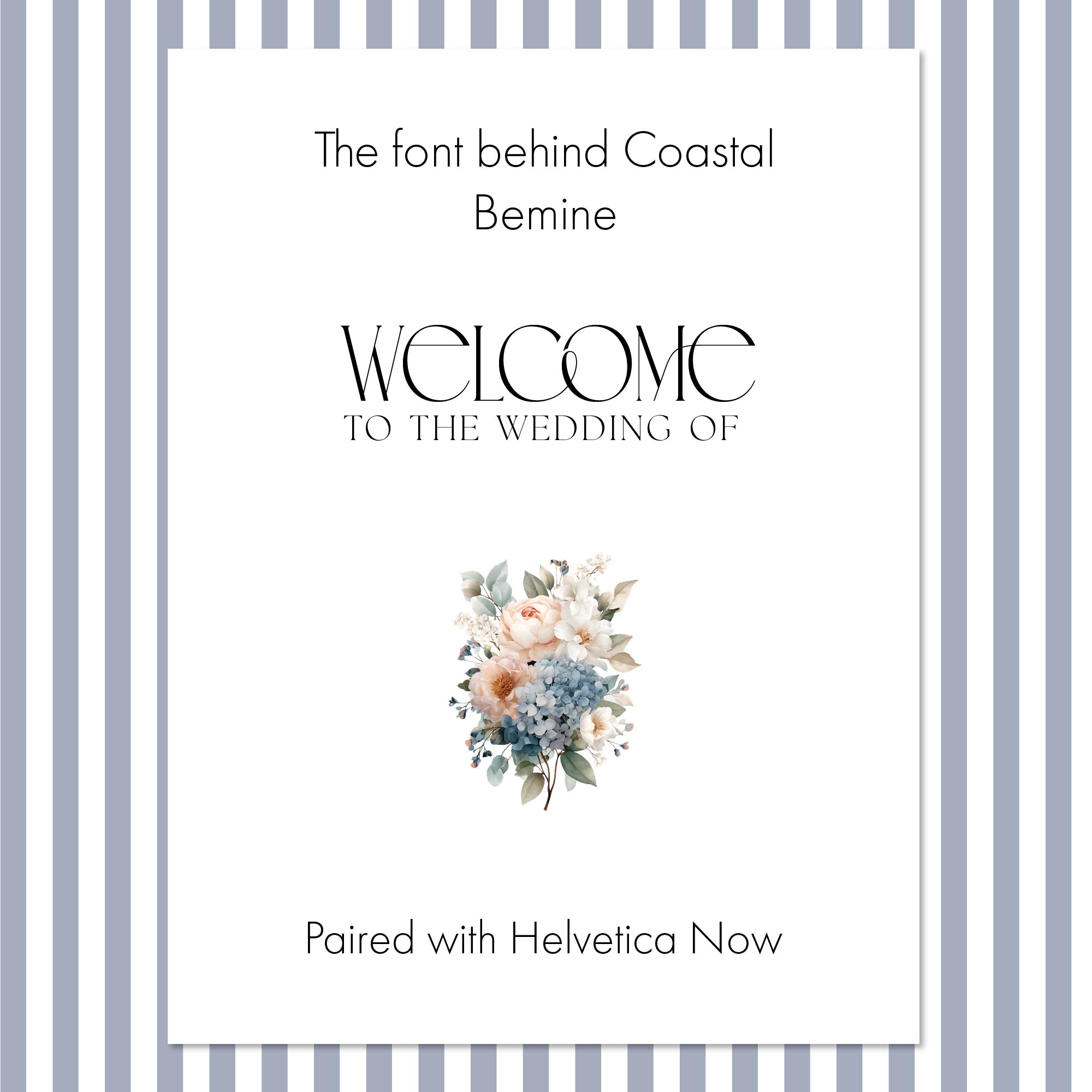
Quick Answer: The Coastal Collection pairs Bemine, an expressive high-contrast display typeface, with the clean and readable Helvetica Now. Bemine gives the suite its distinctive personality, while Helvetica Now handles dates, times, and details with quiet clarity. A traditional serif was intentionally left out because Bemine already brings the fine strokes and dramatic contrast a serif would contribute. Two fonts with the same job would compete rather than complement each other.
Typography can change the entire character of a wedding invitation. The same wording can feel traditional, romantic, modern, or formal depending on the typeface.
When I designed the Coastal Collection, I wanted the typography to express understated coastal elegance without leaning on seashells, anchors, or anything overtly nautical. That meant finding a font with enough personality to become part of the design itself. Bemine was that font.
What Makes Bemine Right for a Coastal Wedding?
Coastal wedding stationery can easily tip into theme territory. I wanted this collection to suggest the coast in a quieter, more sophisticated way.
Bemine has a distinctly editorial quality. Its elongated letterforms, sweeping curves, and delicate hairlines feel elegant without feeling old-fashioned. It carries the polish of a fashion magazine while staying light enough for a celebration by the water.
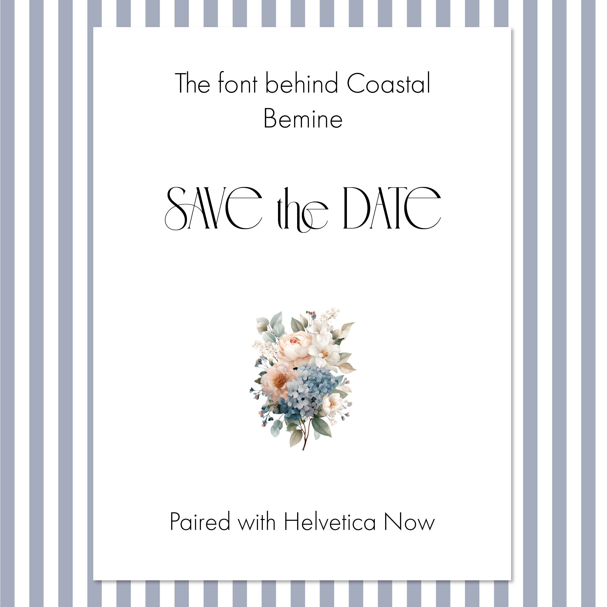
On the Save the Date, the letters become the focal point. Familiar words like "Save the Date" suddenly look custom-drawn, with the graceful flourish connecting the "h" and "e" adding movement across the line.
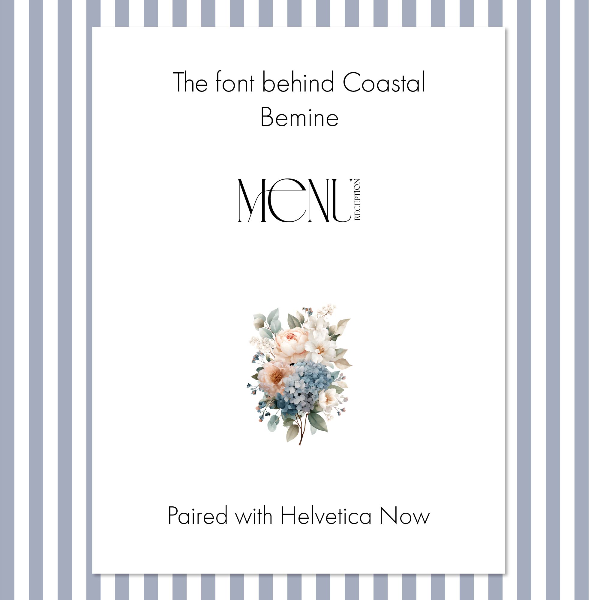
On the welcome sign, a generously sized "Welcome" feels memorable without any border or ornament. On the menu, a simple heading becomes a design element in its own right.
That range is what made Bemine the natural choice.
Is Bemine a Serif or a Sans Serif?
Bemine doesn't fit neatly into either category.
It shares qualities we associate with serif typefaces: dramatic shifts between thick and thin strokes, fine hairlines, and a refined presence. Yet many of its letterforms feel cleaner, more fluid, and more contemporary than a conventional serif.
That blend is exactly what makes it interesting. It is familiar enough to read as elegant and unusual enough to be remembered. It is also why choosing its companion required restraint.
Why Not Pair Bemine With a Traditional Serif?
Pairing an elegant wedding font with a classic serif might seem like the obvious move. Here, it would have introduced too many competing details.
Bemine already delivers the drama and refinement a serif normally brings. Adding a second high-contrast font would create two strong voices, each asking to be noticed, and the result would quickly feel fussy instead of refined.
Good font pairing isn't about finding two equally beautiful typefaces. It's about giving each one a clear job.
Why Is Helvetica Now the Right Partner?
Helvetica Now is clean, balanced, and highly readable. It doesn't try to compete with Bemine. It provides contrast.
Where Bemine is dramatic, Helvetica Now is restrained. Where Bemine has unexpected curves, Helvetica Now has straightforward, even letterforms. They feel distinctly different, yet share a modern sensibility that lets them work as a team.
Just as important, Helvetica Now carries the practical information. Dates, times, locations, and menu descriptions need to be effortless for guests to read. A beautiful typeface loses its purpose if it makes essential details hard to understand.
Together they create a clear hierarchy:
- Bemine draws the eye to key words and headings.
- Helvetica Now organizes and communicates the details.
- Open spacing around both keeps the design light and airy.
Why Does Every Suite Need One Star and One Supporting Player?
One of the most common font pairing mistakes is assuming both fonts need to be equally distinctive. They don't.
Two decorative fonts can weaken each other. When every word demands attention, the reader doesn't know where to look first, and even a small amount of text starts to feel busy.
In the Coastal Collection, Bemine is unmistakably the star and Helvetica Now provides the calm structure behind it. That balance holds across every size, from a bold Save the Date headline to several lines of reception details.
How Is the Coastal Typography Set?
Like every suite in the Heritage Collection, Coastal's display typography isn't a standard font dropped into a template. Each title is hand-set in Adobe Illustrator using licensed fonts, with ligatures and alternate characters selected individually for each phrase.
That is where details like the connected "the" on the Save the Date come from. Those choices are then exported as high-resolution artwork and built into your Canva template, so the typography stays exactly as designed while you personalize everything else.
It's the difference between using a font and designing with one.
How Does Coastal Feel Coastal Without Being Themed?
This isn't novelty beach stationery. There are no ropes, anchors, or shells. Instead, the collection evokes the coast through soft blues and blush tones, watercolor hydrangeas and garden roses, generous spacing, and carefully chosen typography.
Bemine keeps the design from feeling predictable. Helvetica Now keeps it from becoming overly ornate. Together, they create stationery that feels modern and elegant, with the relaxed ease a waterside wedding deserves.