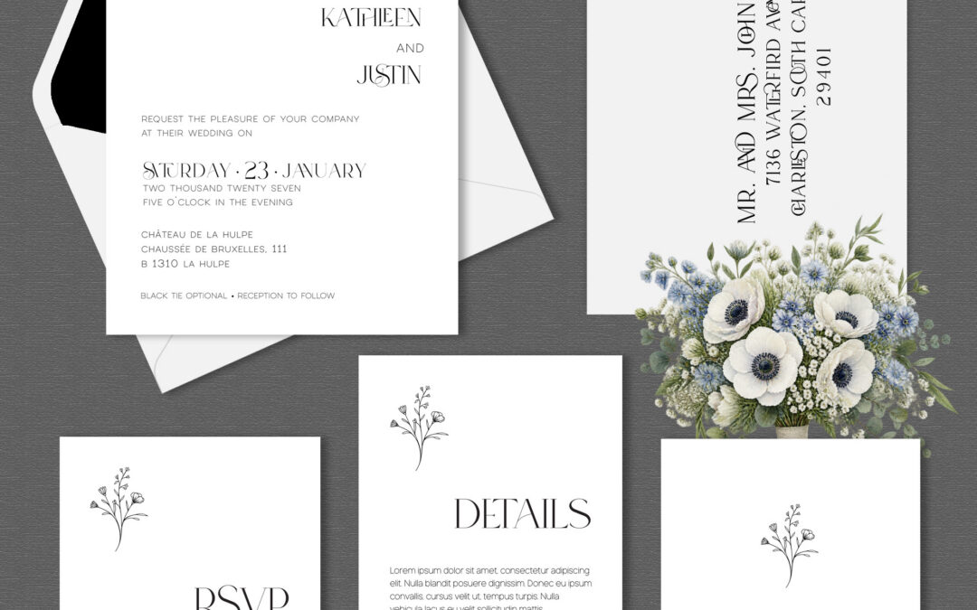
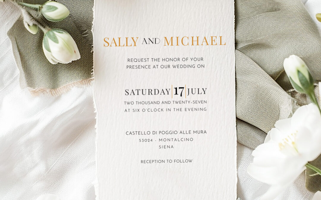
Why my approach to wedding stationery begins with a love of simplicity, beautiful details, and knowing when to leave well enough alone. Quick Answer: The Heritage Collection is built on restraint: clean lines, beautiful typography, subtle flourishes, and room to...
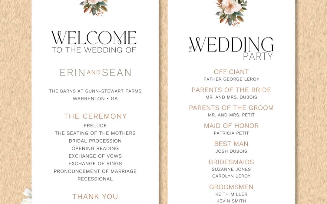
Quick Answer: The magnolia is one of the most recognizable symbols of the American South. Its creamy blossoms and glossy evergreen leaves are woven into the region’s gardens, porches, and family memories, which is why the flower carries associations of beauty,...
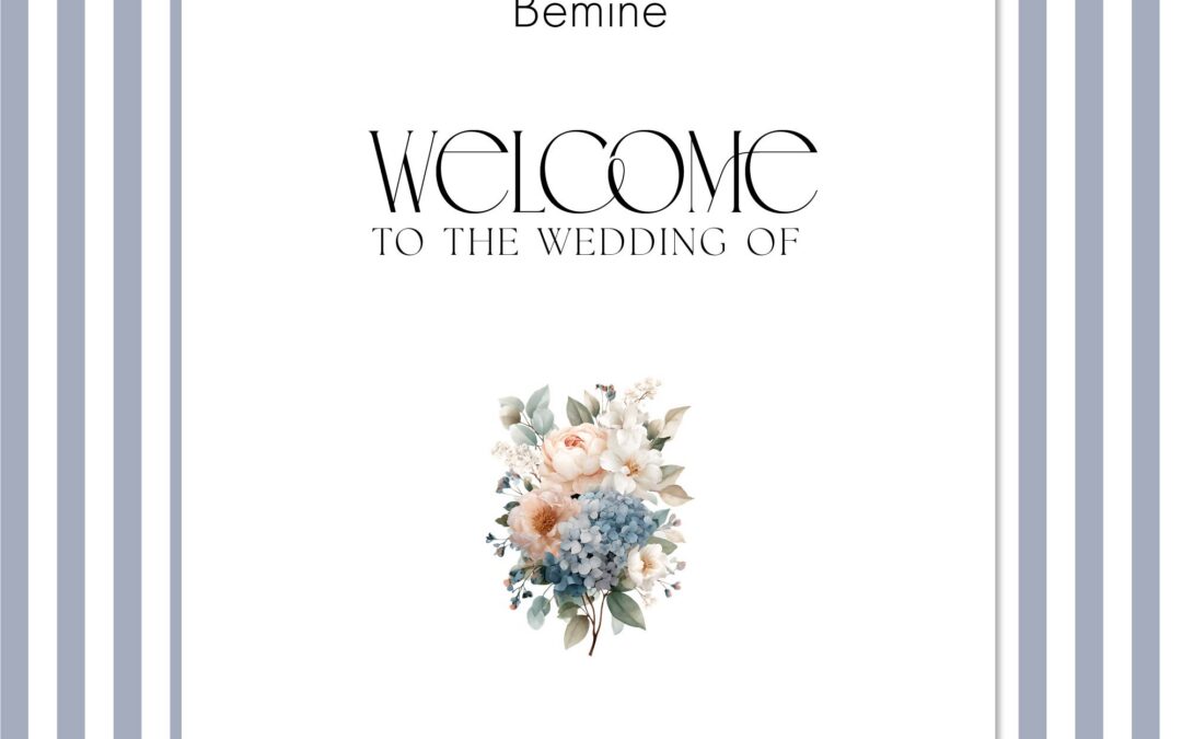
Quick Answer: The Coastal Collection pairs Bemine, an expressive high-contrast display typeface, with the clean and readable Helvetica Now. Bemine gives the suite its distinctive personality, while Helvetica Now handles dates, times, and details with quiet clarity. A...
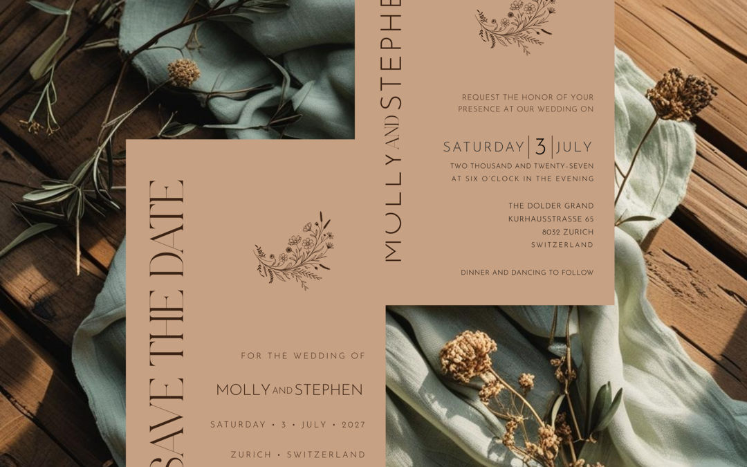
Quick Answer: A cohesive wedding stationery suite carries the same visual story from the save-the-date through the thank-you card. Consistent typography, colors, artwork, and design details help every piece feel connected, not necessarily identical. Planning the...
Quick Answer: Wedding invitations often use more than one font because each part of the invitation has a different job to do. One typeface brings personality and emphasis to the couple’s names, while another makes the date, location, and other details easy to...